
I think it’s been a while since people were honest about website design for startups and tech founders. Most teams aren’t struggling because their product doesn’t work they’re struggling because their website doesn’t explain, convert, or build trust fast enough. It looks fine. It sounds clever. But it leaves people unsure, and unsure users don’t sign up, book calls, or commit.
What I want to do here is strip away the noise and explain what that phrase actually means when growth, credibility, and time are real constraints. Not trends. Not design awards. Just the decisions that help a startup move forward and the quiet mistakes that slow everything down without anyone noticing at first.
By the end of this, you should clearly understand what your website needs to do to support traction instead of getting in the way. I know this isn’t about making something pretty. It’s about making something work. And I’ll do what’s possible to keep it honest and clear.
Key Takeaways
- Website design for startups and tech founders is not about aesthetics — it’s about clarity, trust, and conversion under time pressure.
- A startup website must explain the product, audience, and value within seconds or risk losing users who never come back.
- Design decisions should support growth goals: signups, demos, validation, or investment — not visual trends.
- Poor website design silently slows traction, weakens credibility, and increases customer acquisition costs.
- A well-designed startup website functions as a growth system, not a one-time branding asset.
Why Most Startup Websites Fail (And Why It’s Costing You Users)

Most startup websites aren’t broken — they’re just unclear. They don’t fail loudly. They fail quietly. People land, scroll a little, hesitate, then leave without saying a word. No feedback. No rejection. Just absence. And that’s usually worse.
The problem isn’t that founders don’t care about website design. It’s that the focus is often misplaced. Too much energy goes into how the site looks and not enough into what the site needs to do. So you end up with something polished that doesn’t move anyone closer to a decision. I’ve seen this across early-stage products, funded startups, and even companies that technically have traction but can’t explain themselves properly online.
Most startup websites fail for a few predictable reasons:
They lead with features instead of problems.
They sound clever instead of clear.
They assume context the user doesn’t have.
And when that happens, the website stops being a support system and starts becoming friction. Users shouldn’t have to work to understand you. Investors shouldn’t have to decode your value. If someone has to “figure it out,” they usually won’t.
Another issue is that many founders treat the website as a static object — something you launch and move on from. But in reality, a startup website is a living part of your growth engine. It’s often the first touchpoint, the first proof point, the first place trust is either built or lost. When it’s poorly structured, it quietly increases your acquisition costs because every confused visitor is a missed opportunity.
This is where website design for startups and tech founders starts to separate itself from generic web design. The constraints are different. Time is tighter. Attention is thinner. Credibility hasn’t been earned yet. That means the website has to work harder, faster, and with less margin for error.
I know founders who have strong products but weak websites, and they assume the market just “isn’t responding yet.” In reality, the response is there — it’s just happening off-screen. People are deciding no without telling you why. And unless you’re paying attention to structure, messaging, and user flow, you’ll keep fixing the wrong thing.
If this is landing uncomfortably, that’s usually a sign something needs to be revisited. Not redesigned for aesthetics, but rethought for function. This is also where doing a startup website audit becomes less of a nice-to-have and more of a reality check. It helps you see what the site is actually communicating versus what you think it’s saying.
From here, the conversation needs to move away from failure and into purpose. What role should a startup website actually play once we strip away the noise? That’s the piece most people skip — and it’s where everything starts to make sense.
The Role of a Website in a Startup’s Growth Stack

A website is treated more like a digital brochure. Something you’re “supposed to have,” not something that actively participates in growth. And that’s usually where things start to slip. Because for a startup, the website isn’t optional infrastructure — it’s part of the operating system.
When someone hears about your product for the first time, they don’t talk to you. They don’t read your roadmap. They don’t see the hours you’ve put in. They go to your website. And in that moment, the site becomes the stand-in for the entire company. That’s a lot of weight for a few pages to carry.
This is where website design for startups and tech founders has to be understood in context. Your website isn’t just there to look credible. It’s there to do specific jobs, depending on what stage you’re in and what you’re trying to unlock next.
At an early stage, the site is often about validation. Does this idea make sense? Can people quickly understand the problem and the solution? Will they sign up, join a waitlist, or book a call? If the answer is no, it’s usually not because the idea is weak — it’s because the website didn’t communicate it clearly enough.
As you grow, the role shifts. The website becomes an acquisition layer. It supports content, paid traffic, partnerships, and referrals. It starts answering deeper questions before they’re asked. This is where conversion-focused website design stops being theory and starts becoming essential. Every page has a purpose. Every section earns its place.
There’s also a third role that many founders underestimate: credibility. Investors, partners, and senior hires will look at your website before they ever speak to you. If the positioning is vague or the experience feels careless, it quietly raises questions you’ll have to work harder to undo later. This is why professional website design for startups isn’t about polish — it’s about alignment between what you’re building and how it shows up.
The mistake is trying to make one website do everything without deciding what matters most right now. Growth-stage thinking means prioritization. Your website should reflect that. A clear primary action is better than five half-hearted ones. Focus builds momentum.
I know it’s tempting to treat the website as something to “fix later,” once traction comes. But the irony is that traction often depends on this very thing. A well-structured site doesn’t replace execution — it amplifies it. It makes your work visible, understandable, and easier to trust.
Before we talk design principles or layouts, we need to get one thing right: clarity. Without it, no amount of creativity helps. And that’s where most startup websites quietly go off track.
Design for Clarity, Not Creativity
When designing startup websites we need to ourselves, does this help someone understand us faster, or does it just look impressive? Because those two things are rarely the same. And when they conflict, clarity should always win.
In professional website design for startups, creativity without direction becomes noise. Not because design doesn’t matter — it does — but because a startup doesn’t have the luxury of being misunderstood. You’re asking for attention, trust, and action from people who don’t owe you any of it.
Clarity starts at the top. Literally. What appears above the fold does most of the work, whether we admit it or not. Within seconds, a visitor is trying to answer a few basic questions:
What is this?
Who is it for?
Why should I care?
What do I do next?
If the website avoids these questions or buries them under metaphors and abstract language, people hesitate. And hesitation is where momentum dies. This is why startup website messaging matters just as much as layout. Design should support the message, not distract from it.
One of the most common mistakes I see is founders designing for themselves, not for someone seeing the product for the first time. Internally, everything makes sense. Externally, nothing does. Jargon creeps in. Context is assumed. The website becomes a private language instead of a bridge.
Clarity also means restraint. Not every feature needs to be highlighted. Not every idea needs a section. When everything is emphasized, nothing is. A clear website guides attention. It tells users what matters now, and what can wait. That’s not oversimplifying — that’s respect for their time.
This is where conversion-focused website design for startups becomes practical. Visual hierarchy, spacing, and flow are used to reduce cognitive load, not to show off taste. The goal isn’t to impress designers. It’s to help users move forward with less friction.
I know this part can feel uncomfortable, especially for founders who care deeply about vision and identity. But clarity doesn’t dilute identity — it reveals it. When people understand you quickly, they’re more likely to engage deeply later.
Once clarity is established, design can do its real job. But without it, even the most beautiful website ends up working against the business. And at that point, the problem isn’t creativity. It’s misalignment.
Conversion-Focused Design Principles for Tech Products
It’s been a while since “conversion” stopped meaning manipulation and started meaning respect for how people actually decide. Good startup websites don’t push. They remove friction. They make the next step feel obvious, not forced.
There’s data to back this up. According to a Google study on mobile UX, 53% of users abandon a site if it takes longer than 3 seconds to load. Not because they hate the product — but because the experience already signaled carelessness. That’s design doing damage before content even has a chance.
Another widely cited stat from Nielsen Norman Group shows that users typically scan only about 20–28% of the text on a page. That means your website isn’t read — it’s skimmed. Which is why structure matters more than length. Headlines, spacing, contrast, and flow do the heavy lifting. This is where conversion-focused website design for startups stops being theory and becomes survival.
A simple case study makes this clear.
Basecamp, long before it became a reference point, stripped its homepage messaging down to one clear promise and one clear action. No feature dump. No over-explanation. Just context, reassurance, and direction. The result wasn’t just more signups — it was better ones. People arrived already understanding what they were getting into. That’s design filtering for alignment.
Another example comes from SaaS landing page experiments run by ConversionXL. One test showed that replacing vague hero messaging with a specific value proposition increased conversions by over 30%. Same traffic. Same product. Just clearer design and copy working together. Nothing clever. Nothing flashy.
This matters because tech founders often assume users will “figure it out.” They won’t. Not because they aren’t smart — but because they’re busy. Every extra decision your website asks someone to make quietly lowers the odds they’ll make any decision at all.
Strong conversion-focused design works because it guides, not convinces. It prioritizes:
- Clear primary CTAs instead of multiple competing actions
- Short, purposeful forms instead of data collection for its own sake
- Visual hierarchy that tells users where to look next
- Real product context through screenshots or demos, not abstract promises
This is also why SaaS website design and B2B startup website design require different thinking. A consumer-facing product might optimize for speed and emotion. A B2B product often needs reassurance, use cases, and credibility layered into the flow. One size never fits all.
The common thread across high-performing examples is this: design decisions are tied to outcomes. Not opinions. Not trends. Not what looks good in a portfolio. What helps the right people take the right step?
When this is missing, founders compensate elsewhere — more ads, more outreach, more explanation on calls. When it’s done well, the website does some of that work for you. Quietly. Consistently.
If you’re serious about traction, this is where it’s worth pausing and asking whether your current site is helping or just existing. A focused startup website audit often reveals that the changes needed aren’t dramatic — they’re structural.
Here’s the rewrite — same logic, tightened flow, and with a soft mid-article CTA that feels natural, not salesy.
Trust Signals That Matter to Investors, Users, and Partners
I think it’s been a while since trust was treated as something that slowly builds after onboarding. Online, trust is decided early — often before someone scrolls, clicks, or reads a second section. And for most startups, that decision happens quietly on the website.
In website design for startups and tech founders, trust isn’t a vague feeling. It’s a set of signals. People arrive already cautious. They’re looking for reasons to believe you’re real, competent, and worth paying attention to. When those reasons aren’t obvious, doubt fills the gap.
There’s data to support this. A Stanford Web Credibility study found that 75% of users judge a company’s credibility based on its website. Not the product roadmap. Not the pitch deck. The website. Which means design and structure are shaping trust long before any conversation starts.
Slack understood this early. Their site focused on showing the product clearly, grounding the messaging in real use cases, and reinforcing credibility with recognizable customers. There was confidence without exaggeration. No pressure to convince — just enough proof to make the next step feel safe.
What consistently builds trust for startups and tech products tends to be simple and repeatable:
- Clear evidence that real people or companies use the product
- Actual product interfaces instead of abstract visuals
- Specific use cases that help visitors locate themselves
- Consistent tone and structure that signals intention
This is why many founders feel something is “off” with their website but can’t quite name it. The site might look good, but it doesn’t reassure. It doesn’t answer the quiet question in the back of someone’s mind: can I trust this?
What weakens trust is just as predictable. Stock photos. Broad claims with no context. Language that sounds impressive but says very little. These don’t inspire confidence — they create distance.
For investors and partners, especially, a website often acts as a silent credibility check. They may not say anything, but they notice when positioning is unclear or when the execution doesn’t match the ambition. A website that feels scattered suggests the same might be true internally.
This is usually the moment where a quick outside perspective helps. A focused startup website audit can surface trust gaps founders are too close to see — missing proof, unclear messaging, or unnecessary friction — without requiring a full redesign right away.
Trust doesn’t come from saying the right things. It comes from showing enough to let people decide for themselves. When your website does that well, everything downstream becomes easier.
SEO, Performance, and Scalability From Day One
SEO and performance stopped being optional and started becoming part of basic credibility. A slow website or one that can’t be found doesn’t just limit growth — it quietly signals that fundamentals aren’t being taken seriously.
In website design for startups and tech founders, what sits under the surface matters just as much as what users see. Search engines, AI tools, and humans are all evaluating structure, speed, and clarity at the same time. When those pieces aren’t aligned, the site struggles no matter how good the product is.
Performance is the first filter. Google research consistently shows that as page load time goes from 1 second to 3 seconds, the probability of bounce increases by over 30%. Push that to 5 seconds, and it jumps past 90%. That’s not a marketing issue — that’s a design and architecture problem.
This is why many template-driven startup sites hit a ceiling early. They weren’t built to scale. Heavy scripts, poor structure, and bloated layouts make iteration harder over time. Every new page feels like a workaround instead of progress.
SEO compounds this issue. When founders say, “we’ll fix SEO later,” what they usually mean is they’re postponing structure. Headings aren’t intentional. Pages don’t map to real search intent. Content lives wherever it fits instead of where it supports growth.
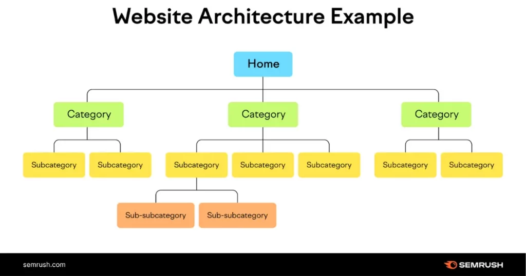
Case studies make this clear. HubSpot didn’t win because of design flash. They built a site architecture that supported long-term content expansion and discoverability. Every page had a purpose. Every section connected to a clear topic cluster. The result wasn’t overnight traffic — it was durable growth.
This matters even more now, with AI-driven search becoming the norm. Clear structure, strong internal linking, and focused topics increase the likelihood that your site is referenced, summarized, or cited. This is where AI-era SEO foundations and scalable website architecture quietly make a difference.
If your site wasn’t designed with this in mind, it often feels fragile. Adding content breaks layout. Updating pages feels risky. Growth becomes something you work around instead of something the website supports.
This is another point where it’s useful to pause and assess. A technical website review for startups can uncover hidden blockers — performance issues, structural gaps, and missed opportunities — before they compound. It’s rarely about tearing everything down. Most of the time, it’s about correcting what’s invisible.
A website that loads fast, scales cleanly, and can be understood by both users and search systems becomes an asset over time. One that can’t eventually turns into debt.
Now we can talk about fit — because not every startup website should be built the same way, and forcing the wrong structure at the wrong stage creates unnecessary friction.
Startup Website Types (And How Design Priorities Change)
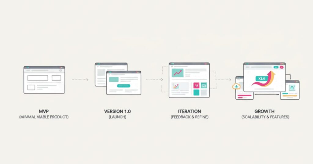
We need to admit that there’s no such thing as a “standard” startup website. What works for one stage can quietly hold another back. And when founders copy what successful companies look like now, instead of what they needed then, things start to break.
In website design for startups and tech founders, stage matters more than style. The goals change, and design priorities have to change with them.
An idea-stage or MVP website is about validation, not persuasion. The job is to explain the problem clearly, show that a real solution exists, and invite a small but relevant action — a waitlist, a conversation, early access. Anything more than that often adds noise. This is where MVP website design benefits from restraint. Fewer pages. Tighter messaging. One clear outcome.
A product-launch or early SaaS website has different pressures. Now the site needs to support acquisition. It has to answer questions faster, show the product in context, and reduce uncertainty. This is where SaaS website design leans heavily on clarity, demos, and use cases. Users are deciding whether to invest time, data, or money — and the website should respect that decision process.
Then there are investor- or partner-facing websites. These don’t need hype. They need coherence. Clear positioning, evidence of traction, and signs that the business understands its market. Many startups accidentally weaken investor confidence by over-designing these pages instead of grounding them in reality.
B2B and B2C products also diverge sharply here. A B2B startup website often needs more explanation, social proof, and reassurance. A B2C site might optimize for speed and emotion. Applying the same structure to both usually means under-serving one audience.
A common failure point is when startups try to build a “future-proof” website too early. They overcomplicate the structure for features, audiences, or markets that don’t exist yet. The site becomes heavy before it needs to be. Growth doesn’t become easier — it becomes harder.
This is where intentional design decisions matter. Not guessing. Not copying. Deciding what the website needs to do now, and what can wait. The best-performing startup websites evolve because they were designed to adapt, not because they were perfect on day one.
If you’re unsure whether your current site matches your actual stage, that uncertainty is often a signal. A quick startup website strategy review can clarify whether your design is supporting momentum or quietly creating drag.
The Cost of Getting Website Design Wrong

We need to talk honestly about cost. Not invoices. Not redesign budgets. The quiet cost that never shows up in a dashboard but still shapes outcomes every day.
When website design for startups and tech founders misses the mark, the damage isn’t dramatic. It’s subtle. Users leave without converting. Good-fit leads never reach out. Investors skim, hesitate, and move on. And because none of that feels like a clear failure, it’s easy to blame something else.
One of the biggest costs is lost momentum. According to research from Adobe, companies with optimized digital experiences are twice as likely to exceed revenue goals compared to those that don’t. That gap isn’t just marketing — it’s clarity, structure, and execution showing up consistently.
Another hidden cost is acquisition inefficiency. You might be driving traffic through content, ads, or outreach, but a weak website turns that spend into leakage. Every confused visitor raises your customer acquisition cost without improving results. The math works against you quietly.
There’s also a credibility cost. A poorly structured or outdated website forces founders to over-explain in calls, pitch decks, and email threads. The website stops pulling its weight. Instead of reinforcing your message, it creates extra work.
I’ve seen startups redesign their websites two or three times within a year, not because they changed direction — but because the original design didn’t align with how the business actually operated. Each redesign burns time, energy, and focus that could have gone into product or growth.
This is why “cheap now, fix later” often becomes the most expensive path. Not because templates are bad, but because design decisions without strategy don’t age well. What seems fast early becomes friction later.
It’s also where founders start doubting execution instead of infrastructure. They assume traction is the issue, when in reality the website isn’t doing its job. That misdiagnosis delays the real fix.
At this point, the question isn’t whether design matters. It’s whether your current website is helping or quietly costing you. A structured website performance and conversion review can make this visible without committing to a full rebuild — clarity before action.
Once you see the cost clearly, the next step becomes easier. That step isn’t aesthetics. It’s understanding what a high-performing startup website actually requires.
What a High-Performing Startup Website Actually Requires
I think it’s been a while since “good website” meant anything concrete. Everyone agrees it matters, but very few people can explain why one works and another doesn’t without falling back on taste. That’s where things get fuzzy, and where most decisions go wrong.
A high-performing site in website design for startups and tech founders isn’t defined by how it looks — it’s defined by how well its parts work together. Strategy, copy, design, and structure need to move in the same direction. When one is missing, the site feels fragmented, even if each element on its own is fine.
The starting point is always clarity of purpose. A website can’t support growth if it isn’t aligned with a clear outcome — signups, demos, validation, revenue, or credibility. Without that anchor, design becomes decoration instead of direction.
Next comes messaging. Not slogans, but understanding. The site needs to speak in the language of the problem, not the internal language of the product. This is where many founders underestimate the role of copy in design. Layout guides attention, but words do the work. When copy and design aren’t built together, conversion suffers.
Then there’s structure. Pages should exist for a reason. Navigation should reduce effort, not offer infinite choice. Content should be layered so people can go deeper if they want to, not because they’re forced to. This is the quiet power of conversion-focused startup websites — they let users choose their depth without getting lost.
A high-performing site also accepts that optimization never ends. The website isn’t “done.” It evolves with feedback, data, and the business itself. Startups that treat their site as a one-off project usually outgrow it faster than they expect.
This is often where founders hit a limit with DIY tools. Templates are useful early, but once strategy, messaging, SEO, and performance need to work as a system, the complexity increases. That’s usually the signal that professional support would save more time than it costs.
If your website feels heavy to maintain, hard to update, or disconnected from how your business actually runs, that’s not a design flaw — it’s a systems issue. One that can be corrected, but not ignored.
The final question becomes timing. Not if to invest in a more intentional approach — but when. And that’s where most founders hesitate longer than they should.
When to Invest in Professional Website Design

I think it’s been a while since “professional” meant strategy instead of polish. Many founders wait until the website feels embarrassing before they act. Others redesign too early, before the business knows what it needs. Both miss the timing.
In website design for startups and tech founders, the right moment isn’t about revenue alone. It’s about friction. When the website starts slowing conversations down instead of supporting them, that’s usually the signal.
There are a few clear signs the DIY phase is over.
You’re spending too much time explaining what your product does.
Traffic is coming in, but conversions aren’t following.
The site feels fragile — small updates break things or feel risky.
You’ve outgrown generic templates, but don’t want guesswork.
At this stage, professional design stops being a cost and starts becoming leverage. Not because the site will suddenly perform miracles — but because the foundation becomes intentional.
The difference with a proper process is not the visual outcome. It’s how decisions are made. Strategy comes first. Messaging is clarified before design begins. Structure is planned with growth in mind. This is where startup website design services earn their value — by removing uncertainty, not by adding features.
Founders often worry they’ll lose control or be pushed into something that doesn’t feel like them. The opposite should be true. A good process makes the business clearer, not diluted. The website becomes easier to maintain, easier to explain, and easier to build on.
What you should expect isn’t perfection. It’s alignment. Clear positioning. Fewer revisions driven by guesswork. A site that supports your goals instead of needing constant fixing.
If you’re unsure whether you’re at this stage, that uncertainty itself is information. A short website strategy consultation for startups can help you decide whether you need a full redesign, targeted improvements, or simply a clearer plan.
Because timing matters. Waiting too long compounds friction. Acting too early wastes resources. The right move sits somewhere in between — informed, intentional, and grounded in what the business actually needs now.
All that remains is deciding what you want your website to do next. And that decision should lead cleanly into action, not more hesitation.
Build a Website That Supports Growth, Not Guesswork
I think it’s been a while since we stopped pretending websites are neutral. They either help momentum or quietly slow it down. There’s rarely a middle ground. And once you see that clearly, it’s hard to ignore.
In website design for startups and tech founders, the goal isn’t to chase best practices for their own sake. It’s to build something that carries the weight of your work — the clarity of your idea, the discipline of your execution, and the direction you’re moving in.
By this point, the pattern should be clear. Most startup websites don’t fail because founders lack vision. They fail because structure, messaging, and design were treated as separate problems. When those pieces don’t align, the site becomes another variable to manage instead of a system you can trust.
A growth-supporting website does a few things consistently. It explains without overloading. It guides without pushing. It earns trust without asking for it. Over time, that compounds. Conversations start warmer. Leads arrive clearer. Decisions happen faster.
If you’ve read this far, you’re probably already sensing where your own website stands. Maybe it’s doing enough for now. Maybe it’s quietly holding you back. Either way, clarity tends to be the most valuable next step.
If you want an outside perspective, this is where working together makes sense. A focused website audit for startups and tech founders can surface what’s working, what’s getting in the way, and what matters most to fix first — without committing to a full overhaul.
From there, the path is simple. You either keep refining what you’ve built, or you invest in something that’s designed to grow with you. Both are valid choices, as long as they’re intentional.
I know I can get things done when the direction is clear. The same applies here. A website that’s built with purpose stops being a question mark and starts becoming support. And from there, growth feels less like guesswork and more like progress.
Frequently Asked Questions (FAQs)
These are the questions people actually type when they’re trying to make a decision, not when they’re browsing for inspiration.
What makes website design for startups different from regular web design?
Startup website design focuses on speed, clarity, and conversion under uncertainty. Unlike established businesses, startups need their website to explain value quickly, build trust fast, and support growth before brand recognition exists. It’s less about aesthetics and more about function.
How much should a startup realistically spend on website design?
There’s no single number, but the real question is cost versus friction. A cheap website that slows conversions, weakens credibility, or needs constant fixing usually costs more over time than a focused, well-structured build that supports growth.
Do startups really need professional website design early on?
Not always. Early-stage startups can start simple. But once traffic, outreach, or fundraising begins, unclear messaging or weak structure becomes a bottleneck. That’s usually the point where professional input saves time rather than adds expense.
What should be on a startup website homepage?
At minimum: a clear problem statement, who the product is for, what it does, proof that it works, and one obvious next step. If a visitor has to think too hard, the homepage isn’t doing its job.
Can a website affect investor perception?
Yes. Investors often review a website before a meeting. Inconsistent messaging, vague positioning, or poor execution can quietly undermine confidence, even if the product itself is strong.
Is SEO important for startup websites early on?
SEO foundations matter from day one. Clean structure, fast performance, and intentional content make future growth easier. Fixing SEO later often means undoing design decisions that didn’t account for it.
- Startup Website Audit for Founders
- Conversion-Focused Website Design for Startups
- SaaS Website Strategy and Structure
- Professional Website Design Services for Tech Companies
- Website Strategy Consultation for Startups