
Google now ranks your website based on its mobile version first not desktop. If your mobile experience is slow, cluttered, or hard to navigate, your search rankings will reflect that. Here’s what to do about it in 2025.
Understanding Mobile-First Indexing
Mobile-first indexing means Google’s crawlers visit and evaluate your site as a mobile user would. Desktop performance still matters, but it’s no longer the primary signal. If your mobile site is missing content, loads slowly, or breaks on small screens, you’re competing with a handicap — regardless of how good your desktop version looks.
Learn how to create a mobile friendly website
1. Use a Responsive Design That Adapts to Any Screen
A responsive site doesn’t maintain separate URLs for mobile and desktop — it serves the same HTML and adjusts its layout fluidly based on screen size. This is Google’s recommended approach, and it eliminates the risk of inconsistent content across versions.
What to implement:
- Fluid grid layouts that reflow naturally on any screen width
- CSS media queries to control typography, spacing, and image sizes per device
- Flexible images that scale within their containers rather than overflowing
2. Speed Up Your Mobile Load Time
Mobile users abandon pages that take more than three seconds to load. Every optimization below directly affects your bounce rate — and therefore your rankings.
What to implement:
- Compress images using modern formats like WebP without visible quality loss
- Reduce HTTP requests by combining scripts and eliminating unused plugins
- Enable browser caching so returning visitors load your site from local storage, not your server
| 📊 Benchmark Use Google PageSpeed Insights to test mobile speed separately from desktop. A score of 90+ on mobile is a realistic target for most sites. |
3. Design for How Mobile Users Actually Read
Mobile readers scan. They make quick decisions about whether to stay based on the first few lines and whether buttons are easy to tap. Design with that reality in mind.
What to implement:
- Lead with your most important information — don’t bury the point below the fold
- Use a minimum 16px font size; smaller text forces pinching and zooming
- Make tap targets (buttons, links) at least 44×44 pixels with clear spacing between them
4. Optimize for Voice Search
Voice queries are phrased differently than typed ones. Someone typing might search “mobile SEO tips 2025”; the same person speaking might ask “what’s the best way to optimize my site for mobile in 2025?” Your content needs to answer both.
What to implement:
- Write in a conversational tone and include question-and-answer phrasing naturally in your content
- Add FAQ sections that mirror how people actually ask questions aloud
- Use structured data markup (schema.org) to help Google surface your content in voice results and rich snippets
5. Add Structured Data
Schema markup gives Google explicit context about your content — whether it’s an article, product, event, or FAQ. This doesn’t directly boost rankings, but it increases your chances of appearing in rich results, which significantly improves click-through rates.
What to implement:
- Use JSON-LD format for structured data (Google’s preferred method)
- Add breadcrumb schema to improve both user navigation and Google’s understanding of your site hierarchy
- Validate your markup using Google’s Rich Results Test before publishing
6. Lock Down Mobile Security
HTTPS is table stakes in 2025 — sites without it receive a ranking penalty and trigger browser security warnings that erode user trust immediately.
What to implement:
- Migrate entirely to HTTPS if you haven’t already; most hosting providers offer free SSL certificates
- Avoid intrusive pop-ups that cover content on mobile — Google penalizes interstitials that block the main content on load
7. Monitor and Test Continuously
Mobile optimization isn’t a one-time task. Google updates its crawling behavior, devices change, and your site evolves. Build regular testing into your workflow.
What to implement:
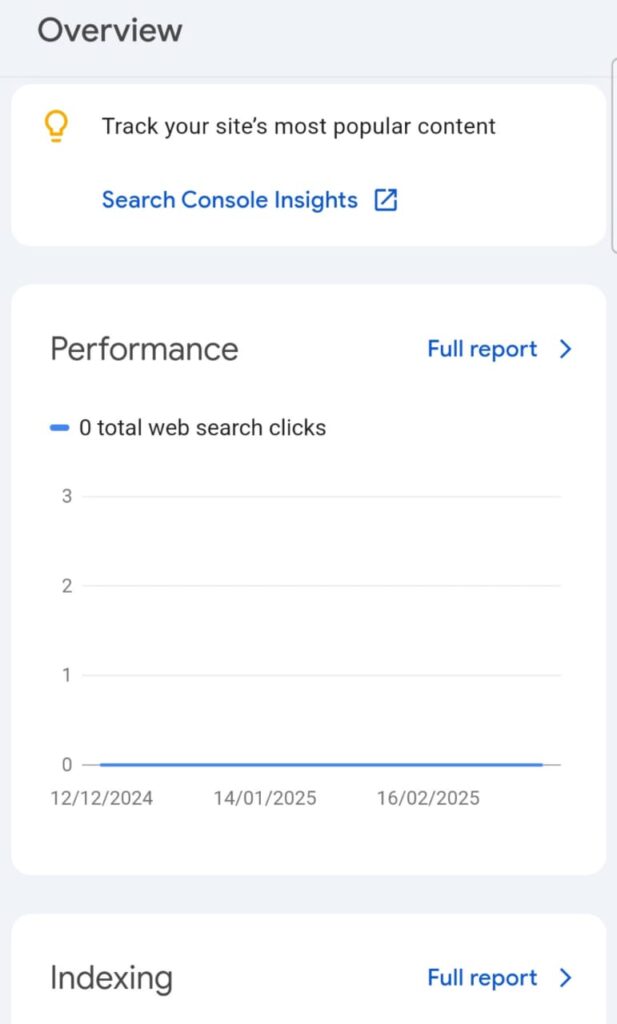
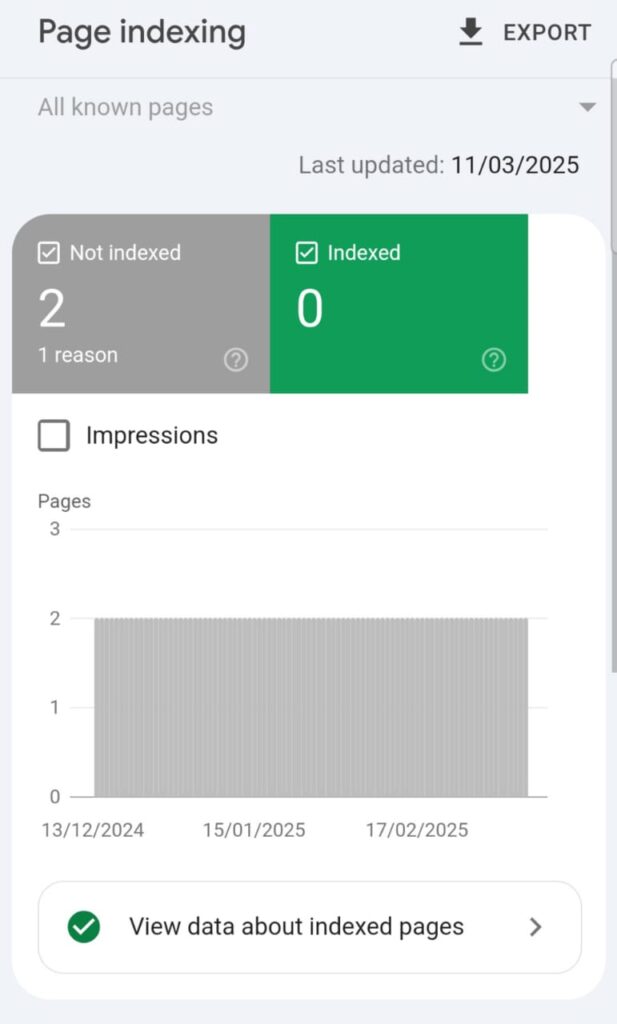
- Check Google Search Console’s Mobile Usability report monthly to catch new errors
- Run usability sessions with real users on actual devices — not just emulators — at least once per quarter
- Set up Core Web Vitals monitoring in Search Console to track LCP, CLS, and INP over time
Where to Start
If you’re only going to do one thing this week: run your site through Google’s PageSpeed Insights on mobile. The report will surface your biggest bottleneck immediately — whether that’s image compression, render-blocking scripts, or server response time. Fix the top issue, then come back. Mobile optimization compounds; every improvement makes the next one easier.
Monitoring and Testing When Doing Mobile-First Indexing
- Mobile Usability Reports: Regularly check Google’s Mobile Usability Report in Search Console to identify and fix issues.
- User Testing: Conduct usability testing with real users to gather feedback and make necessary adjustments.
Conclusion
Optimizing your website for mobile-first indexing in 2025 is not just about keeping up with trends; it’s about providing a seamless and efficient user experience that aligns with search engine expectations. By implementing these strategies, you position your website for better rankings and user engagement in the mobile-centric digital landscape.