I t’s been a while since we talked honestly about low website conversions without jumping straight to tactics. Most people don’t wake up deciding their website is broken. They just notice something isn’t moving. Traffic comes in. Pages look fine. But leads don’t follow. Sales feel harder than they should. And there’s no clear alert telling you what’s wrong.
That’s what makes this problem expensive. When a site isn’t performing, it rarely fails loudly. It underperforms quietly. You assume it’s the market, the offer, or the timing — when in reality, the website isn’t doing the job it’s supposed to do. Not because it’s ugly or outdated, but because it isn’t guiding decisions the way a high-performing site should.
What most business owners miss is that a website isn’t just there to exist or “look professional.” Its responsibility is simple and heavy at the same time: help the right people understand your value quickly enough to take the next step with confidence. When that doesn’t happen, conversions drop — even if everything else feels solid.
This is where diagnosing matters more than redesigning. Before changing colors, layouts, or tools, you need to understand why people hesitate and where momentum breaks. A clear website conversion audit often reveals that the issue isn’t effort — it’s misalignment. And once that’s visible, fixes become focused instead of reactive.
By the end of this article, you’ll be able to recognize the real warning signs behind low website conversions, understand why they persist even when traffic grows, and know when it’s time to look deeper — whether through a conversion-focused website review or a broader website performance strategy.
No fluff. No panic. Just clarity. And from there, progress tends to come a lot easier.
Key Takeaways
- Low website conversions are rarely obvious — they show up as hesitation, confusion, and missed opportunities rather than clear failures.
- A website can look professional and still underperform if it doesn’t guide users toward a clear next step.
- Growing traffic without growing conversions usually signals structural or messaging issues, not a demand problem.
- High-performing websites reduce friction, build trust early, and support decisions instead of forcing them.
- Diagnosing conversion issues is more effective than redesigning blindly.
What “High-Converting” Really Means (Before Diagnosing Anything)
“Cconversion” stopped meaning pressure and started meaning clarity. Somewhere along the way, it got mixed up with tricks, louder buttons, and more aggressive CTAs. And that’s usually where people go wrong when they’re dealing with low website conversions.
A high-converting website isn’t trying to convince anyone. It’s trying to remove uncertainty. It helps people understand where they are, what you offer, and what the next step looks like — without making them work for it. When that happens, conversion feels natural. When it doesn’t, people hesitate and leave.
This is why throwing more traffic at a site that isn’t converting rarely helps. Traffic just amplifies the problem. More people see the same confusion. More people feel the same friction. The issue isn’t volume — it’s alignment.
Most websites underperform because they confuse attention with intent. Someone scrolling, reading, or clicking doesn’t automatically mean they’re close to deciding. A high-converting site is designed to gently move users from curiosity to clarity to action. That movement is intentional, not accidental.
It’s also where design and copy stop being separate things. Words explain. Design guides. When those two don’t work together, conversions suffer. This is something a structured conversion-focused website review often exposes quickly — mismatched messaging, unclear hierarchy, or calls to action that don’t match where the user actually is.

Another mistake is optimizing the wrong metric. High page views don’t matter if nothing follows. Time on site doesn’t matter if users still leave unsure. Conversion is the only signal that the website is doing its job. Everything else is supporting data.
If your website is clear, people don’t need to guess. They don’t need a follow-up email to understand what you do. They don’t need a call to feel reassured. The site does that work quietly, before any conversation starts. That’s the difference between a website that exists and one that performs.
Before we label anything as broken, this definition matters. Without it, fixes become cosmetic. With it, patterns start to show — and those patterns are what we’ll look at next, starting with the earliest and most common warning sign.
Warning Sign #2: You Have to Explain Your Business on Every Call
When every sales call, intro meeting, or demo starts with you explaining what you do, who it’s for, and why it matters, that’s not communication — that’s compensation. And more often than not, it points straight back to low website conversions.
A website that’s working should do some of the heavy lifting before a conversation ever starts. It should pre-sell, pre-qualify, and set expectations. When it doesn’t, people arrive interested but unclear. They ask basic questions your site should have already answered. You spend time correcting assumptions instead of moving forward.
This is where many business owners misdiagnose the problem. It feels like a sales issue. Or a lead quality issue. Or a “people don’t get it fast enough” issue. In reality, it’s usually a positioning and messaging problem — the website isn’t translating your value in a way that lands with someone encountering it for the first time.
If your site uses internal language, vague promises, or generic statements, visitors can’t place themselves in the story. They don’t know if the product is meant for them. So they wait for a call to figure it out. That hesitation carries through the entire funnel and quietly drags conversions down.
This is one of the clearest moments where a conversion-focused website review pays for itself. It exposes the gap between what you think you’re communicating and what a new visitor actually understands. The fix isn’t usually more content — it’s clearer content, structured better.
When messaging is right, calls change. People come in with context. Questions are sharper. Conversations move faster. The website has already done its job, and the call becomes confirmation, not discovery.
If you’re constantly explaining, your site is staying silent when it shouldn’t. And that silence is part of why conversions stay low.
Warning Sign #3: Traffic Is Growing, but Conversions Aren’t
I think it’s been a while since we stopped questioning what “more traffic” actually means. On the surface, it feels like progress. Numbers go up. Reports look better. But when low website conversions persist alongside growing traffic, that’s not growth — it’s exposure.
More traffic doesn’t fix a weak structure. It just reveals it faster.
This is one of the most frustrating places for business owners to sit. You’re doing the work — content, ads, partnerships, outreach — and people are arriving. But nothing meaningful follows. No increase in leads. No lift in enquiries. Just activity without outcome.
What’s usually happening here is an intent mismatch. Traffic is being sent to pages that don’t match what people expect to see. Headlines don’t answer the question that brought them there. Value propositions stay broad when they should be specific. The result is quick exits and quiet drop-offs.

Another contributor is poor page hierarchy. When everything is given equal weight, nothing stands out. Visitors don’t know where to focus or what matters most. They scroll, sample a bit of everything, then leave. This is where conversion-focused website design stops being optional and starts becoming necessary.
It’s also common for landing pages to behave like general pages. Too much background. Too much explanation. Not enough direction. Each page should have a clear job. When that’s missing, traffic leaks instead of converting.
At this point, many people double down on traffic, assuming volume will solve the issue. It rarely does. A targeted website conversion audit often shows that a small number of structural changes would unlock far more value than another campaign ever could.
When a site converts well, you feel it immediately. Growth becomes efficient. Effort compounds instead of dissipating. When it doesn’t, traffic becomes noise.
Warning Sign #4: Your Website Looks Good but Doesn’t Convert
This is one of the most deceptive places for low website conversions to hide — because on the surface, everything seems fine. The visuals are clean. The branding feels intentional. Nothing looks broken. And yet, results stay flat.
A good-looking website can still be weak if it isn’t built with purpose. Design without strategy tends to prioritise aesthetics over outcomes. Pages are arranged to please the eye, not to guide decisions. What you end up with is something impressive to look at, but quiet when it needs to speak.
This is where brand-led design often works against conversion. When identity takes precedence over clarity, visitors admire the site without understanding it. They scroll, they nod, they leave. Beauty holds attention, but structure drives action.
Another common issue is design decisions made in isolation. Layout, copy, and calls to action are treated as separate tasks instead of parts of one system. When those pieces don’t work together, friction creeps in — and friction shows up as hesitation.
This is usually the moment founders start tweaking surface details. Colours change. Buttons move. Sections get added. But the underlying issue stays the same because the structure hasn’t been questioned. This is why a conversion-focused website review is often more effective than a redesign. It helps you see what the site is actually asking people to do — and where that request breaks down.
If your website feels solid but underperforms, it’s worth pausing before making changes. A short website conversion audit can reveal whether the problem is visual, structural, or simply unclear — without committing you to a full rebuild. That kind of clarity saves time and prevents reactive decisions.
When a website converts well, it feels effortless. Not flashy. Not loud. Just aligned. When it doesn’t, it often hides behind polish. And that makes it harder to diagnose without stepping back.
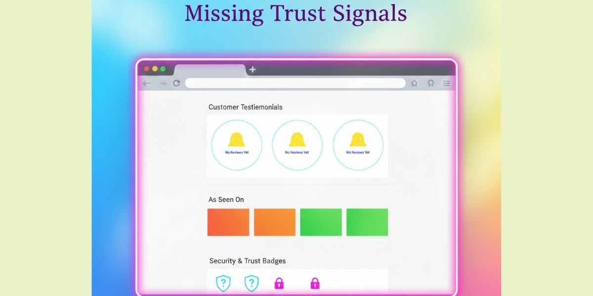
Warning Sign #5: Trust Has to Be Earned Manually
I think it’s been a while since we acknowledged how early trust is decided online. Long before a demo. Long before a reply. Often before the second scroll. When low website conversions persist even though interest exists, trust is usually the missing link.
There’s data behind this. A study from Stanford Web Credibility Project found that 75% of users judge a company’s credibility based on its website. Not the product. Not the pitch. The website. That means trust isn’t something you build later — it’s something your site either signals immediately or fails to.
You can see this in practice with companies like Basecamp in their early growth years. Their site didn’t rely on hype or buzzwords. It showed the product, explained the problem plainly, and backed claims with real context. Fewer promises. More proof. That restraint made decisions easier for users, and conversions followed.
Contrast that with what Nielsen Norman Group consistently observes in usability testing: vague claims, stock imagery, and generic testimonials actively increase user skepticism. When visitors can’t verify what you’re saying, they assume the safest option is to leave.
This is also where many sites unintentionally put extra work on the founder. If trust isn’t established on the page, it gets rebuilt manually — in calls, emails, decks, and follow-ups. That doesn’t just slow sales; it limits scale. The website stops being support and starts being a dependency.
Another stat worth paying attention to comes from Baymard Institute, which shows that lack of trust signals is one of the top reasons users abandon forms and checkout processes. The same principle applies outside ecommerce: if the site doesn’t reassure, people hesitate at the exact moment you need confidence.
Trust signals don’t need to be loud. They need to be real:
- Clear use cases instead of abstract claims
- Product screenshots or demos instead of illustrations
- Specific testimonials instead of praise with no context
- Consistent messaging instead of shifting tone page to page
If you’re unsure whether your site is doing this well, it’s usually because you’re too close to see the gaps. A focused website conversion audit often surfaces trust issues quickly — missing proof, unclear positioning, or moments where reassurance should appear but doesn’t.
When trust is built properly, conversions don’t feel pushed. They feel safe. And when trust is missing, even interested users wait — or walk away.
Warning Sign #6: Small Changes Feel Risky or Break Things
I think it’s been a while since we called fragility what it is. When a website feels delicate — where a small copy change, a new page, or a layout tweak risks breaking something — that’s not caution. That’s a structural problem. And it’s one of the quieter contributors to low website conversions.
A website that converts well is built to be adjusted. Tested. Improved. When updates feel risky, optimization stops. And when optimization stops, performance plateaus — even if demand exists.
There’s research that backs this up. Data from HTTP Archive consistently shows that many modern websites are weighed down by unnecessary scripts, bloated themes, and performance issues that degrade user experience over time. Slower sites don’t just frustrate users — they reduce willingness to act.
Google has been clear on this as well. According to performance benchmarks cited by Google, as page load time increases from one second to three seconds, the probability of bounce increases by over 30%. Push past that, and the drop-off becomes dramatic. Conversion doesn’t fail because the offer is weak — it fails because the experience feels unreliable.
This fragility usually comes from patchwork decisions. A plugin added to solve one problem creates another. A template stretched beyond its limits becomes harder to maintain. Design, SEO, and copy changes stack without a unifying system. Over time, the website becomes something people are afraid to touch.
I’ve seen businesses delay necessary updates for months because “the last change caused issues.” That hesitation alone is costly. If you can’t adjust messaging, test positioning, or improve flow without fear, the website stops being a growth tool and turns into a constraint.
This is another moment where redesigning isn’t always the answer. Often, a structured website performance and conversion audit reveals that a few foundational fixes — simplifying structure, improving performance, cleaning up dependencies — restore confidence and unlock progress.
High-converting websites aren’t rigid. They’re resilient. They’re built with the expectation that the business will evolve, and the site will evolve with it. When that’s missing, every improvement feels like a risk — and risk avoidance quietly keeps conversions low.
The final piece is understanding why all of these issues persist, even when the people running the business are capable, thoughtful, and doing many things right.
Why These Issues Persist (Even for Smart Businesses)
Most cases of low website conversions don’t happen because the people behind the business don’t know what they’re doing. They happen because those people are too close to the thing they’ve built.
When you live inside your product every day, it’s easy to forget what it feels like to encounter it cold. Context becomes invisible. Assumptions sneak in. Language that makes perfect sense internally starts to confuse anyone new. That’s not carelessness — it’s familiarity.
Another reason these issues stick around is the “we’ll fix it later” mindset. Websites are treated as static background infrastructure, not something that needs to evolve alongside the business. Early wins mask structural weaknesses. By the time conversions drop noticeably, the problems are layered and harder to isolate.
There’s also fragmentation. Design is handled here. Copy is handled there. SEO lives somewhere else entirely. Each part is improved in isolation, with good intentions, but no shared system. The website becomes a collection of optimizations instead of a coherent experience. This is where a unified conversion-focused website strategy tends to outperform piecemeal fixes — not because it’s bigger, but because it’s aligned.
What makes this especially tricky is that many of these issues don’t show up clearly in analytics. Numbers tell you what is happening, not why. Heatmaps, recordings, and dashboards are useful, but without interpretation, they rarely point to the root cause. That’s where external perspective matters.
A structured website conversion audit works precisely because it removes proximity. It looks at the site the way a real visitor would — without insider knowledge, without attachment. Patterns become obvious quickly. Gaps stand out. And the problem stops feeling abstract.
The truth is, most businesses don’t need more effort. They need clearer feedback. Once that exists, decisions get easier, priorities sharpen, and fixes stop being reactive.
From here, the conversation shifts. Because once you understand why conversions are low, the real question becomes what a high-performing website actually does differently — not in theory, but in practice.
Frequently Asked Questions (FAQs)
These are the questions people actually search when they’re frustrated, confused, or trying to decide whether the problem is really their website.
Why does my website get traffic but no conversions?
This usually means there’s a disconnect between why people arrive and what the page asks them to do next. The issue is rarely traffic volume — it’s unclear messaging, poor structure, or missing trust signals that cause hesitation.
What causes low website conversions most often?
The most common causes are unclear value propositions, too many competing CTAs, weak trust signals, slow performance, and websites that explain features instead of outcomes. Low conversions are almost always a clarity problem before they’re a marketing one.
How do I know if my website is the problem or my offer is?
If you’re constantly explaining your business, seeing interest without follow-through, or hearing “I wasn’t sure what you did” on calls, the website is likely part of the problem. A clear site should answer basic questions before a conversation starts.
Can a website look professional and still not convert?
Yes — very often. A site can look polished but still fail to guide decisions. Visual quality doesn’t equal performance. Conversion depends on structure, messaging, and flow, not appearance alone.
How do I fix low website conversions without redesigning everything?
Start with diagnosis, not changes. A focused audit often reveals that a few high-impact issues — messaging clarity, CTA alignment, trust placement — matter more than a full redesign. Most fixes are structural, not cosmetic.
When should I worry about low website conversions?
If traffic is steady but results aren’t improving, or if you’re spending more time compensating for the website in calls and follow-ups, that’s the point to pay attention. Waiting usually makes the problem more expensive to fix.
If this article reflects what you’re experiencing, these next steps usually bring clarity faster:
- Website Conversion Audit for Low Website Conversions
- Conversion-Focused Website Review
- Website Performance and Optimization Strategy
- Conversion-Focused Website Design Services
- Website Strategy Consultation