Mobile devices have become an integral part of our lives with more people accessing the internet primarily through smartphones and tablets. Businesses must ensure their websites are optimized for mobile viewing. A mobile-friendly website enhances user experience, improves search engine rankings, and boosts conversions. Is your website mobile-friendly? Lets see what you can do to make it so.
The Importance of A Mobile-Friendly Website

Statistics In A Mobile-Friendly Website
As of 2024, mobile devices account for more than 55% of all web traffic. This trend underscores the critical need for mobile optimization for your website in your digital strategy.
User Experience For A Mobile-Friendly Website
Mobile-friendly websites provide a seamless experience for users on the go. They’re easier to navigate, load faster, and adapt to various screen sizes. According to Google, 61% of users are unlikely to return to a site that isn’t mobile-friendly, and 40% will visit a competitor instead.
SEO Benefits In A Mobile-Friendly Website
Google’s mobile-first indexing approach means it primarily uses the mobile version of a site for ranking and indexing. Websites that fail to optimize for mobile may suffer in search engine rankings, resulting in reduced visibility and traffic.
Key Elements of A Mobile-Friendly Website
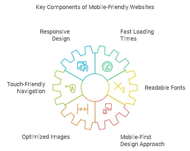
- Responsive Design: Automatically adjusts layout and content based on screen size.
- Fast Loading Times: Optimized to load quickly on mobile networks; ideally under 3 seconds.
- Touch-Friendly Navigation: Features larger buttons and simplified menus for easier interaction.
- Readable Fonts: Ensures text is legible without zooming.
- Optimized Images: Uses appropriately sized images to enhance performance without sacrificing quality.
Mobile-First Design Approach In A Mobile-Friendly Website
The mobile-first design approach emphasizes creating websites with mobile users in mind before adapting them for desktop use. This strategy ensures that core functionalities and user experiences are prioritized for the growing number of mobile users.
Benefits of Mobile-First Design In A Mobile-Friendly Website
- Improved user engagement
- Higher conversion rates
- Better overall performance across devices

Best Practices for Mobile Optimization In Creating A Mobile-Friendly Website
- Simplified Layout and Content: Focus on essential information to avoid clutter.
- Prioritizing Essential Information: Ensure critical content is easily accessible.
- Utilizing White Space Effectively: Improves readability and reduces cognitive load.
- Implementing Easy-to-Use Forms: Simplifies user interactions to boost conversions.
Technical Considerations For A Mobile-Friendly Website
| Consideration | Description |
|---|---|
| CSS Media Queries | Allows different styles based on device characteristics |
| Viewport Meta Tag | Ensures proper scaling on different devices |
| Flexible Grids and Images | Adapts layout elements to fit various screen sizes |
Testing and Tools In A Mobile-Friendly Website
- Google’s Mobile-Friendly Test: Analyzes your website’s mobile compatibility.
- Cross-Device Testing: Ensures functionality across multiple devices and screen sizes.
- Performance Testing Tools: GTmetrix and Pingdom help assess performance metrics.
Impact on SEO and Search Rankings For A Mobile-Friendly Website
Mobile page speed is a critical ranking factor. Slow-loading sites can negatively affect search rankings. User engagement metrics such as bounce rates and time spent on site are increasingly important indicators of SEO performance.
Common Mistakes to Avoid To Get Mobile-Friendly Websites
- Non-scalable Images: Images that do not resize can disrupt layout.
- Tiny Touch Targets: Small buttons can frustrate users trying to navigate.
- Intrusive Pop-ups: Can lead to poor user experiences and increased bounce rates.
- Complex Menus: Extensive or complicated menus can frustrate mobile users.
- Ignoring Font Size Adjustments: Using fonts that are too small can make content difficult to read.
- Faulty Redirects: Incorrectly implemented redirects can lead users to unexpected pages.
- Disabling Pinch and Zoom Features: Can hinder accessibility for users who need to enlarge text or images.
Designing Effective Mobile Menus In Mobile-Friendly Websites

Best Practices for Mobile Menus In Mobile-Friendly Websites
- Keep It Simple and Concise: Limit menu items to 4-7 to avoid overwhelming users.
- Use Clear and Descriptive Labels: Ensure menu items are labeled accurately and concisely.
- Optimize for Touch Interactions: Design menu elements at least 44 pixels in size for easy tapping.
- Consider Visual Hierarchy: Organize menu items to highlight the most important actions.
- Incorporate a Search Function: Include a search bar for quick content discovery.
- Utilize Familiar Navigation Patterns: Implement common patterns like the hamburger menu or bottom navigation bars.
- Provide Feedback and Visual Cues: Use visual indicators to show users their current page and provide interaction feedback.
- Design for Multiple Device Sizes: Ensure the menu adapts responsively across various devices.
- Implement Sticky Menus When Appropriate: For content-heavy pages, consider using sticky menus that remain visible while scrolling.
- Test and Iterate Based on User Feedback: Continuously refine the design based on user testing and feedback.
Visual Appeal in Mobile Menus In Mobile-Friendly Websites
- Maintain a Consistent Design: Use a limited color palette aligning with your brand identity.
- Incorporate Visual Cues: Use icons alongside text to enhance comprehension and scannability.
- Implement Subtle Animations: Add animations when the menu opens or closes for a dynamic experience.
- Enhance Readability: Use easy-to-read fonts with appropriate sizes and spacing.
Accessibility in Mobile Menus
Ensuring your mobile menu is accessible to users with disabilities is crucial for inclusivity and compliance with web standards.
Accessibility Best Practices
- Use Semantic HTML: Employ semantic markup to enhance the accessibility of your menu.
- Ensure Keyboard Accessibility: Make all interactive elements navigable using a keyboard.
- Provide Sufficient Contrast: Use high contrast between text and background colors.
- Add Text Labels to Icons: Provide descriptive text labels for each icon.
- Implement Accessible Dropdowns and Submenus: Design dropdowns that are easy to navigate using a keyboard.
- Include Clear and Descriptive Navigation Labels: Use clear, concise labels for all menu items.
- Ensure Touch Targets Are Adequate: Design touch targets at least 44×44 pixels in size.
- Provide Voice-Over Capabilities: Implement features that support voice-over or screen reading capabilities.
- Test for Accessibility: Regularly test your mobile menu using automated accessibility tools and manual checks.
Enhancing Keyboard Accessibility
- Ensure All Menu Items Are Focusable: All interactive elements should be accessible via keyboard navigation.
- Implement Clear Focus Indicators: Provide visible focus styles for menu items when selected.
- Use Descriptive Labels: Ensure all menu items have clear and descriptive labels.
- Utilize ARIA Roles and Properties: Implement ARIA roles and properties to enhance menu accessibility.
- Allow Keyboard Shortcuts for Common Actions: Incorporate common keyboard shortcuts to facilitate navigation.
- Avoid Hover-Activated Menus: Design menus activated by clicks rather than hover actions.
- Implement Skip Links: Include skip links at the top of your page for direct navigation.
- Provide Feedback on Actions: Use auditory or visual feedback when users interact with menu items.
Future Trends in Mobile Web Design
- Progressive Web Apps (PWAs): Combine the best of web and mobile apps for enhanced user experiences.
- Voice Search Optimization: Adapt content for voice queries as usage increases.
- AI-driven Personalization: Tailor experiences based on user behavior and preferences.
Case Studies
Before and After Comparison

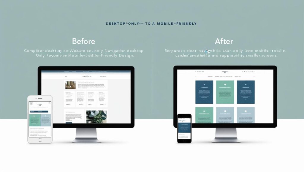
This image showcases the transformation of a website from desktop-only to a responsive, mobile-friendly design. The mobile version features simplified navigation, larger touch targets, and optimized content layout.
Success Story: E-commerce Site Revamp
A mid-sized e-commerce company implemented a mobile-first redesign, resulting in:
- 35% increase in mobile conversions
- 28% reduction in bounce rate
- 42% improvement in average time on site
These improvements led to a significant boost in revenue and customer satisfaction.
Call-to-Action
Evaluate your website’s mobile-friendliness today. If you need to revamp your website di it with these website redesign strategies. Consider leveraging professional digital services to optimize your site for an increasingly mobile audience, ensuring you don’t miss out on potential customers.
Get a Free Mobile-Friendly Website Assessment
Conclusion
In a mobile-centric world, having a mobile-friendly website is no longer an option but a necessity. By implementing responsive design, optimizing for speed, creating accessible and visually appealing menus, and focusing on user experience, you can create a website that not only looks great on mobile devices but also drives engagement, conversions, and search engine rankings.
Remember to regularly test and iterate your mobile design based on user feedback and emerging trends. Stay ahead of the curve by embracing new technologies like PWAs and voice search optimization. With a well-executed mobile strategy, your website will be poised for success in the ever-evolving digital landscape. Are you interested in User-Centric Design Tips To Enhance Your Website Usability, Click here for more.
