Remarkable Ways To Revamp Your Website Now: Website Redesign Strategies
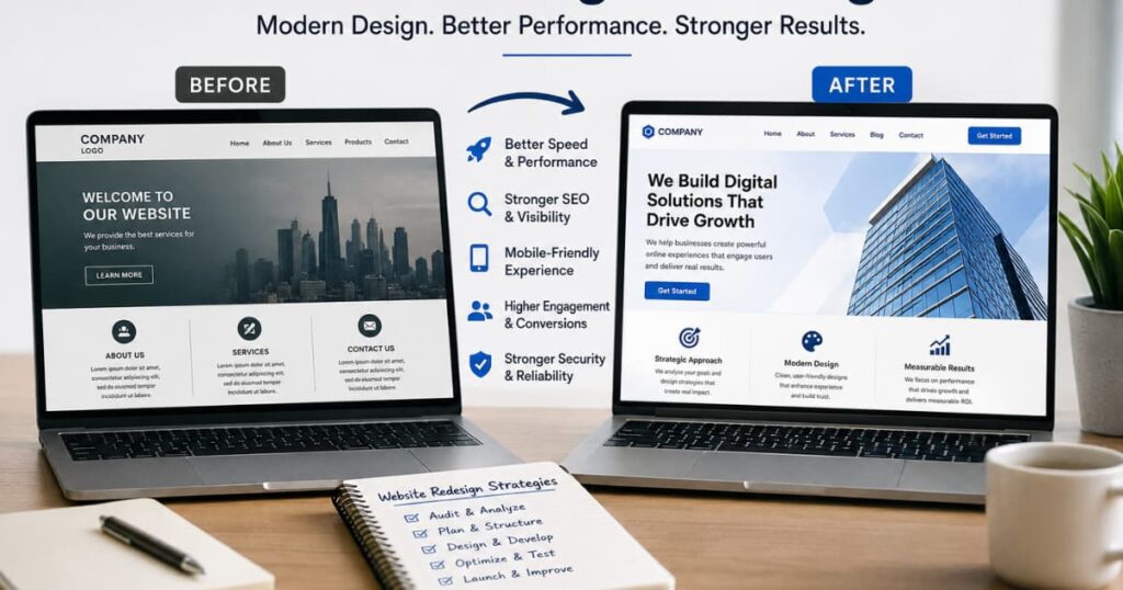
Website redesign strategies matter now because many business websites quietly become outdated long before owners realize they are losing customers. I’ve seen businesses spend heavily building websites years ago, then avoid touching them while customer behavior, search engines, and mobile browsing changed completely around them. The result is usually predictable:
- slower performance
- poor mobile experience
- weaker SEO visibility
- lower trust
- declining conversions
Most customers will not explain why they leave a website. They simply move to another option when the experience feels frustrating.
That is why website redesigns became less about aesthetics and more about usability, speed, clarity, and operational performance.
A strong redesign does not necessarily mean rebuilding everything from scratch. In many cases, businesses improve results significantly by:
- simplifying navigation
- improving mobile responsiveness
- optimizing speed
- restructuring content
- modernizing layouts
- upgrading website templates
Modern platforms such as WordPress, Shopify, and Webflow made website redesign strategies much more accessible because businesses can now refresh websites faster without long development cycles. Responsive design and mobile-first structures also became critical for SEO and user experience.
In this article, I’ll break down the most practical website redesign strategies businesses can use right now, what actually improves performance, and how to avoid redesign decisions that create more problems later.
What Are Website Templates and Themes?
Most businesses talk about websites as if they are purely creative projects.
That is usually the first misunderstanding.
A website is infrastructure first. The design matters, yes. But underneath the visuals is a system handling:
navigation
content structure
speed
responsiveness
user behavior
search visibility
That is where templates and themes come in.
People often use those words interchangeably, but they are not exactly the same thing.
Website Templates Handle Structure
A website template is usually the structural layout of a website or specific page.
It controls things like:
page arrangement
section placement
navigation structure
content flow
responsive behavior
In simple terms, templates determine how the website functions visually and operationally.
For example, an ecommerce template may already include:
product pages
checkout layouts
filtering systems
mobile shopping structures
A service-business template may include:
contact forms
booking sections
testimonials
service pages
That matters because most businesses are not inventing entirely new website behavior. They are repeating familiar patterns customers already understand.
Templates standardize those patterns.
That is why they became powerful.
Themes Control Appearance More Than Structure
Themes usually sit closer to visual identity.
They control:
colors
typography
styling
spacing
visual presentation
The structure may remain similar underneath while the appearance changes.
This distinction matters because many businesses redesign websites cosmetically while leaving deeper structural problems untouched.
The site may look “modern” visually but still:
load slowly
confuse users
bury important information
perform poorly on mobile
weaken SEO visibility
That is the difference between appearance and infrastructure.
A fresh coat of paint does not fix weak architecture.
Why Businesses Started Relying More on Templates
The shift toward templates happened because businesses discovered something practical:
most websites are trying to solve the same operational problems repeatedly.
Customers want to:
find information quickly
trust the business
navigate easily
complete actions smoothly
Templates accelerated that process because businesses stopped rebuilding common systems from scratch every single time.
Platforms such as WordPress, Shopify, and Webflow expanded heavily once businesses realized standardized systems reduced friction around launching and maintaining websites.
The interesting part is this:
customers rarely care whether a website was custom-built.
They care whether it works.
Reasons To Use WebsiteTemplates For Your Business
The Hidden Problem With Many Website Redesigns
I think many redesign projects fail because businesses confuse visual change with operational improvement.
They redesign logos.
Change colors.
Add animations.
Meanwhile:
navigation remains confusing
page speed stays poor
mobile experience breaks
content structure weakens
SEO visibility declines
The redesign becomes cosmetic maintenance instead of system repair.
Templates expose that issue clearly because they force businesses to confront structure directly:
What does the user actually need?
What information matters first?
What slows the site down?
What causes people to leave?
Those questions usually matter more than visual trends.
That is why template-driven redesigns often outperform expensive custom redesigns operationally.
They focus on solving repeated infrastructure problems instead of performing originality.
Why Businesses Redesign Websites
Most businesses do not redesign websites because they suddenly become creative.
They redesign because something stops working.
Traffic drops.
Conversions weaken.
Customers leave faster.
Mobile experience feels broken.
The site becomes harder to maintain than the business itself.
What looks like a “design problem” is usually an infrastructure problem that has been ignored too long.
That is the pattern underneath many redesign projects.
Websites Age Operationally Before They Age Visually
This is something businesses miss often.
A website can still look acceptable while performing poorly underneath.
For example:
pages load slowly
navigation becomes cluttered
plugins conflict
mobile layouts break
content structures weaken
SEO visibility declines
The problem is that these issues compound quietly.
Customers rarely send emails explaining why they left the site. Search engines do not announce visibility decline dramatically either. The deterioration happens gradually until the business notices:
fewer inquiries
weaker rankings
lower engagement
reduced trust
By then, the website is usually carrying years of accumulated neglect.
Most Redesigns Start Reactively
Very few businesses redesign websites proactively.
Usually, the redesign starts after:
competitors appear more modern
traffic drops
leads slow down
the mobile experience becomes frustrating
the backend becomes difficult to manage
That reaction makes sense structurally.
Websites sit in an unusual position inside businesses. They are expected to:
market the company
support SEO
generate leads
process sales
communicate trust
adapt to new devices
integrate with changing platforms
…while often receiving minimal maintenance attention for years.
Eventually the system drifts out of alignment with how customers actually behave online.
That is what triggers redesign pressure.
Mobile Behavior Changed Website Expectations Completely
This shift matters more than many businesses realize.
A large part of web traffic now comes from mobile devices, which changed:
browsing patterns
attention spans
navigation expectations
loading speed tolerance
Responsive design and mobile-first usability became operational requirements, not optional upgrades.
Many older websites were built during a desktop-first internet era. They technically still function, but the experience feels slow and awkward on phones:
menus become frustrating
layouts feel crowded
buttons are difficult to tap
important information gets buried
Customers interpret that friction as business unreliability very quickly.
Businesses Often Confuse Cosmetic Problems With Structural Problems
This is probably the most common redesign mistake.
A company notices declining performance and assumes:
“We need a more modern design.”
So they:
change colors
add animations
redesign logos
introduce trendy visuals
Meanwhile:
page speed remains poor
navigation stays confusing
content hierarchy weakens
SEO structure breaks further
The redesign becomes visual maintenance instead of operational repair.
That is why some redesigns actually reduce performance instead of improving it.
The surface changes.
The infrastructure problem stays.
Good Website Redesign Strategies Usually Remove Things
This part sounds counterintuitive initially.
But many redesign improvements come from removing:
unnecessary scripts
bloated layouts
excessive plugins
confusing menus
competing calls-to-action
The internet trained businesses to think “more features” means “better websites.”
Operationally, the opposite is often true.
Clearer systems usually:
load faster
convert better
rank more consistently
create less friction
remain easier to maintain
That is why many effective redesigns feel simpler afterward, not more complicated.
The interesting thing is this:
customers usually experience website quality as clarity, not creativity.
Most redesign projects forget that.
5 Remarkable Website Redesign Strategies That Actually Improve Results
Most website redesigns fail quietly.
Not because the designers were untalented.
Not because the business lacked ideas.
They fail because businesses redesign surfaces while ignoring systems.
The internet rewards clarity, speed, and usability. But many redesign projects are still driven by internal preferences:
executives wanting something “modern”
teams chasing trends
agencies optimizing for visual presentation
stakeholders adding features to justify budgets
Meanwhile, users are trying to do something much simpler:
find information quickly and leave with less friction than they arrived with.
That mismatch creates many bad redesigns.
1. Simplify Navigation and User Flow
This is usually the first structural problem.
Businesses slowly accumulate pages, menus, categories, popups, banners, and calls-to-action over years. Nobody removes anything because every department believes its section matters.
Eventually the website starts reflecting internal company politics more than customer behavior.
The navigation becomes crowded because the business stopped prioritizing user decision-making.
A redesign should correct that.
Good navigation reduces cognitive load. Users should understand:
where they are
what the business does
where to go next
…within seconds.
Many redesigns improve performance simply by removing:
unnecessary menu items
duplicated pages
competing CTAs
bloated homepage sections
The interesting thing is that users often experience simplicity as professionalism.
Not because the website is visually minimal, but because the system feels predictable.
2. Improve Mobile Responsiveness
A surprising number of businesses still treat mobile optimization like a secondary design adjustment.
Operationally, mobile is often the primary environment now.
That changes everything:
navigation spacing
content hierarchy
loading expectations
form design
page structure
Older websites were built during a desktop-first internet. Many technically still function on phones, but the experience feels hostile:
oversized menus
unreadable text
slow-loading assets
confusing layouts
Users interpret that friction quickly as business unreliability.
Responsive redesign strategies matter because mobile browsing behavior is fundamentally impatient. People are often:
multitasking
moving
comparing options rapidly
The tolerance for confusion is low. (msinteractive.com)
That is why responsive redesigns often improve results without changing the business itself.
The infrastructure simply stopped fighting user behavior.
3. Optimize Website Speed and Performance
This is where many redesigns become performative.
Businesses add:
animations
video backgrounds
motion effects
interactive elements
…because visual intensity creates the feeling of sophistication internally.
Operationally, it often damages performance.
Research consistently shows users abandon confusing or slow interfaces quickly. Excessive visual intensity also increases negative user response faster than it improves engagement.
There is an important distinction here:
people enjoy smooth experiences, not necessarily complex ones.
Fast websites create trust because responsiveness feels stable.
Slow websites create doubt because instability feels risky.
That psychological layer matters more than many redesign projects acknowledge.
Good redesign strategies usually improve speed by:
compressing assets
reducing scripts
simplifying layouts
removing unnecessary plugins
restructuring content
Many performance gains come from subtraction, not addition.
4. Refresh Visual Design Without Overcomplicating It
This is where redesign projects drift into ego sometimes.
Businesses want websites that “look impressive.” But impressive to whom?
Users usually care about:
clarity
readability
trust
ease of use
Not whether the homepage resembles a design awards submission.
Minimal UX systems often outperform visually overloaded interfaces because users process information faster when the structure stays clear.
That does not mean websites should look dull.
It means design should support comprehension instead of competing with it.
A redesign should modernize:
typography
spacing
readability
consistency
visual hierarchy
…without turning the website into a distraction machine.
Many businesses still confuse attention with effectiveness.
Those are not the same thing.
5. Rebuild Content Structure Around SEO and User Intent
This is probably the most overlooked redesign layer.
Many websites organize content around how the company thinks internally instead of how customers search externally.
That creates friction everywhere:
vague service pages
unclear headings
buried information
weak SEO structure
poor search visibility
Search engines increasingly reward websites that align structure with user intent and usability.
That means redesigns should examine:
what users actually search for
what information people need first
what pages create confusion
where customers leave
Good SEO redesign is not stuffing keywords into pages.
It is restructuring information so both users and search engines understand the website more easily.
That usually improves:
visibility
conversions
engagement
navigation clarity
The hidden pattern underneath successful redesigns is surprisingly consistent:
they remove friction faster than they add features.
How Website Redesign Strategies Affect SEO
Many businesses still treat SEO like a separate department problem.
Design happens first.
SEO gets “added later.”
That separation is one reason redesigns damage traffic so often.
Search engines do not experience websites visually the way humans do. They evaluate:
structure
speed
mobile usability
content hierarchy
internal linking
page stability
So when a redesign changes infrastructure carelessly, rankings often move with it.
The frustrating part is that businesses usually notice the traffic drop after launch, not during planning.
Redesigns Can Improve SEO or Quietly Destroy It
Both outcomes happen regularly.
A redesign can improve SEO when it:
simplifies navigation
improves mobile responsiveness
increases speed
restructures content clearly
removes technical clutter
But redesigns also damage SEO constantly because businesses:
change URLs carelessly
remove high-performing pages
weaken internal linking
overload sites with scripts
break mobile usability
That is why some websites look newer after redesigns but perform worse operationally.
The appearance improved.
The search infrastructure weakened.
SEO audits before redesigns matter because rankings, traffic, and conversions can shift significantly during structural changes.
Google Prioritizes Mobile Infrastructure Now
This changed website redesign logic completely.
Google moved toward mobile-first indexing years ago because user behavior shifted heavily toward smartphones.
That means search visibility now depends heavily on:
mobile responsiveness
loading speed
touch usability
responsive layouts
readable content structures
Many older websites still operate with desktop-era assumptions underneath:
oversized layouts
crowded menus
heavy page structures
slow mobile rendering
They technically function, but the experience fights modern user behavior.
Responsive redesign strategies matter because Google increasingly evaluates the mobile version of the website first, not the desktop version.
That creates an uncomfortable reality for businesses:
you are no longer optimizing websites for how teams inside the company browse.
You are optimizing for distracted mobile users moving quickly between options.
Those are different environments entirely.
Speed Became a Trust Signal
This is another structural shift many redesigns misunderstand.
Businesses often redesign websites to look “premium,” then accidentally slow them down with:
animations
autoplay media
oversized assets
bloated frameworks
unnecessary plugins
Operationally, slower websites create instability.
Users may not explain it directly, but slow response times increase frustration and abandonment behavior.
Fast websites feel trustworthy partly because responsiveness signals reliability subconsciously.
That is why redesigns focused purely on aesthetics often fail. They optimize appearance while degrading performance infrastructure underneath.
.
SEO Problems Usually Begin in Navigation
This gets overlooked constantly.
Businesses reorganize websites internally based on departments, campaigns, or management priorities instead of user intent.
Then they wonder why:
bounce rates rise
rankings weaken
users leave quickly
Search engines rely heavily on structure to understand:
page relationships
content importance
crawl pathways
topical relevance
Clear navigation helps both users and search engines interpret the website more efficiently.
Good redesign strategies simplify pathways instead of multiplying them.
That usually means:
fewer distractions
clearer hierarchies
stronger internal linking
simpler content structures
Not more pages fighting for attention simultaneously.
Many Businesses Redesign Emotionally
This is probably the hidden issue underneath bad redesigns.
Executives get bored with the old design.
Competitors launch something flashy.
Agencies pitch “modernization.”
So redesign decisions become driven by aesthetics, not operational analysis.
But websites are not fashion products.
They are infrastructure systems handling:
trust
discovery
navigation
visibility
transactions
communication
When redesigns prioritize visual novelty over usability, SEO usually weakens quietly afterward.
The businesses that redesign successfully tend to ask different questions:
What friction are users experiencing?
What slows the site down?
What content actually performs?
Where do visitors leave?
What mobile behaviors changed?
That mindset changes redesign strategy completely.
The redesign stops being cosmetic.
It becomes structural maintenance.
Website Templates vs Custom Website Redesigns
Most businesses frame this decision incorrectly from the beginning.
They ask:
“Should we redesign using templates or build something fully custom?”
But underneath that question is usually another one:
“Are we solving an operational problem or trying to signal importance?”
Those are different motivations.
Custom redesigns often feel more prestigious internally because they imply originality and investment. But operationally, many businesses do not actually need highly custom systems. They need:
clearer navigation
better mobile responsiveness
faster performance
easier maintenance
stronger SEO structure
A template-based redesign can solve all of those problems without rebuilding the internet from scratch.
Templates Standardize Common Problems
This is the part many businesses resist emotionally.
Most websites are not structurally unique.
Customers still want the same core things:
predictable navigation
readable content
fast loading
clear calls-to-action
smooth mobile experiences
Templates work because they standardize solutions to those repeated behaviors.
That is why platforms such as WordPress, Shopify, and Webflow expanded so aggressively. Businesses realized standardized infrastructure reduced operational friction around redesigns and maintenance. (webasegroup.com)
The interesting thing is this:
users rarely reward originality if the website becomes harder to use.
Custom Redesigns Often Introduce Complexity Quietly
This is where many redesign projects drift.
Businesses commission custom systems thinking flexibility automatically creates advantage. But flexibility also creates:
more maintenance
more dependencies
longer testing cycles
higher development costs
more failure points
Over time, the website becomes harder to update because too many parts depend on custom behavior.
Then the business starts avoiding changes entirely because every adjustment feels risky or expensive.
That pattern happens constantly.
The redesign was supposed to modernize operations.
Instead, it increased maintenance pressure.
Templates Usually Improve Speed of Iteration
This matters more than many businesses realize.
A website is not a static object anymore. It changes constantly:
landing pages evolve
SEO priorities shift
customer behavior changes
products move
content expands
Template-driven redesigns support iteration because the infrastructure remains easier to manage.
Teams can:
update layouts faster
publish content quicker
improve pages continuously
test changes with less friction
That operational flexibility often matters more long term than deep customization.
Especially for businesses still adapting to changing markets.
The Real Difference Is Infrastructure Philosophy
Custom redesigns optimize for maximum control.
Template redesigns optimize for operational efficiency.
Neither is automatically better.
But businesses often underestimate how expensive total control becomes over time:
maintenance grows
systems drift
compatibility problems increase
redesign cycles become heavier
Meanwhile, many template ecosystems now include:
responsive design
accessibility support
SEO structures
ecommerce functionality
performance optimization
Modern website infrastructure became increasingly modular because businesses realized rebuilding common systems repeatedly creates diminishing returns. (thinkhouse.com )
Many Businesses Do Not Need “Unique.” They Need Clear.
This is probably the uncomfortable truth underneath many redesign conversations.
Businesses often chase uniqueness while users are chasing clarity.
A customer rarely says:
“I wish this navigation was more innovative.”
They usually want:
faster answers
cleaner structure
less friction
easier decisions
That is why many template-based redesigns quietly outperform expensive custom builds.
They focus on operational usefulness instead of performative originality.
The redesign stops being about impressing internal stakeholders.
It starts serving actual user behavior instead.
Performance, Security, and Accessibility Considerations
This is usually where website redesign conversations become uncomfortable.
Because once you move past aesthetics, you start dealing with maintenance realities businesses often avoid thinking about:
speed decay
plugin bloat
security neglect
accessibility gaps
infrastructure drift
Most websites do not become bad suddenly.
They slowly accumulate friction over time.
A plugin gets added.
A tracking script stays forever.
A temporary landing page never gets removed.
A redesign prioritizes visuals over performance.
Years later, the website feels heavy without anyone clearly understanding why.
Website Speed Problems Usually Start With Accumulation
Businesses often think slow websites come from “bad hosting” alone.
Sometimes they do. But more often, speed problems come from accumulation:
oversized images
excessive scripts
animation overload
bloated themes
unnecessary integrations
Every department wants something added:
chat widgets
analytics tools
popups
marketing trackers
visual effects
Very few people are incentivized to remove anything later.
That creates infrastructure weight quietly.
Research consistently shows users abandon slow or unstable interfaces quickly because performance affects trust and usability directly.
The interesting part is this:
people experience speed emotionally before they understand it technically.
Fast websites feel reliable.
Slow websites feel risky.
Find Out The Cost Of A slow Website to You
Accessibility Is Usually Ignored Until It Becomes Expensive
Most businesses still treat accessibility like a compliance checklist.
Operationally, it is a usability system.
Accessibility affects:
navigation clarity
readability
keyboard usability
content structure
mobile experience
cognitive load
The problem is that many redesigns optimize for visual novelty instead:
low-contrast text
experimental navigation
motion-heavy layouts
hidden interactions
Those choices often reduce usability for everyone, not only users with disabilities.
WCAG 2.2 guidelines increasingly became baseline expectations because accessible structures improve both usability and discoverability.
There is also a structural reason accessibility keeps getting ignored:
good accessibility work is often invisible when done correctly.
Nobody celebrates:
readable spacing
proper heading structure
keyboard-friendly navigation
But users notice immediately when those systems fail.
Security Problems Usually Begin With Neglect, Not Hackers
This is another thing businesses misunderstand.
Most website security problems are not cinematic cyberattacks.
They come from operational neglect:
outdated plugins
abandoned themes
weak update policies
bloated dependencies
poor maintenance processes
Websites become vulnerable slowly.
The redesign launches.
Everyone celebrates.
Then maintenance attention disappears for three years.
Meanwhile:
software ecosystems change
integrations drift
compatibility weakens
vulnerabilities accumulate
That pattern happens constantly because businesses often budget heavily for launches but very little for maintenance infrastructure afterward.
Many Redesigns Increase Complexity Instead of Stability
This is where redesign incentives become strange.
Agencies often benefit from:
more features
larger rebuilds
more visual complexity
longer development cycles
Users benefit from:
clarity
stability
predictability
speed
Those incentives do not always align.
That is why many redesigns become heavier instead of better.
Performance-first design approaches are increasingly replacing trend-driven redesigns because businesses discovered users reward simplicity operationally.
The websites performing best long term are often not the most visually aggressive ones.
They are usually the systems that:
remain maintainable
adapt cleanly
reduce friction consistently
survive technological drift better
Good Infrastructure Usually Feels Boring
That is probably the hidden truth underneath good website systems.
Strong infrastructure rarely looks dramatic.
It quietly:
loads quickly
stays readable
works across devices
handles updates smoothly
supports users predictably
Most businesses spend too much time chasing visual excitement and too little time protecting operational stability.
But users usually reward stability more than creativity.
Especially online, where patience has become extremely thin.
How to Choose the Right Website Template During a Redesign
Most businesses choose website templates emotionally first, then operationally later.
That is usually backwards.
A template is not just a visual layer. It becomes part of the website’s infrastructure:
how content flows
how pages load
how updates happen
how mobile users navigate
how SEO scales over time
The problem is that many redesign decisions still happen inside meetings dominated by aesthetics:
“Make it look modern.”
“Add more movement.”
“This competitor’s site looks impressive.”
Meanwhile, users are trying to do something simpler:
understand the business quickly without friction.
That difference matters more than most redesign conversations acknowledge.
Most Templates Fail Because Businesses Choose Them for the Wrong Reason
A visually impressive demo can hide serious infrastructure problems underneath:
bloated scripts
poor mobile responsiveness
weak SEO structure
accessibility failures
slow loading speed
This happens because template marketplaces are optimized to sell appearance first.
The demo only needs to create excitement long enough for the purchase.
Long-term maintainability is often invisible during selection.
That is why many businesses end up redesigning again a year later.
Mobile Responsiveness Matters More Than Visual Complexity
This is one of the biggest shifts underneath modern redesign strategy.
A large percentage of users now experience websites almost entirely through phones. That changes what “good design” actually means operationally:
faster loading
cleaner layouts
touch-friendly navigation
readable spacing
reduced clutter
Responsive-first structures consistently outperform overloaded desktop-era designs because user behavior changed faster than many businesses adapted. (codevix.com)
The uncomfortable truth is this:
many redesigns are still optimized for internal desktop presentations, not real customer behavior.
Speed Should Be Evaluated Before Design Style
Most businesses test templates visually.
Very few test them operationally.
That creates problems because slow infrastructure usually reveals itself later:
after plugins accumulate
after content expands
after mobile traffic increases
after SEO growth scales
A fast template with simpler architecture usually survives growth better than a visually aggressive one overloaded with effects.
Research increasingly shows that users associate speed with trust and reliability subconsciously. (uxpilot.ai)
That matters because redesigns are often trying to improve trust indirectly.
Meanwhile, the infrastructure quietly undermines it.
Accessibility Became a Structural Requirement
Many redesign projects still treat accessibility as optional polish.
Operationally, accessibility increasingly overlaps with:
SEO
usability
mobile clarity
legal compliance
navigation quality
WCAG 2.2 standards are becoming more normalized because accessible systems usually improve overall usability too. (webaim.org)
The important thing here is that accessible websites often feel simpler and clearer for everyone:
readable typography
predictable navigation
logical structure
cleaner interactions
Those are usability advantages, not just compliance tasks.
Businesses Should Evaluate Templates Like Infrastructure, Not Decoration
This changes the entire selection process.
Instead of asking:
“Does this template look impressive?”
The better questions are:
How fast does it load?
How easy is it to maintain?
Does it scale cleanly?
Does it stay readable on mobile?
Will updates break the system?
Does the structure support SEO properly?
Those questions sound less exciting internally.
But they usually predict long-term website stability much more accurately than visual trends do.
Simpler Systems Usually Age Better
This pattern appears repeatedly online.
Websites overloaded with:
animations
integrations
visual effects
excessive plugins
…often become harder to maintain over time.
Meanwhile, cleaner template systems usually:
adapt faster
update easier
remain more stable
create less technical debt
That is the hidden trade-off underneath many redesign decisions:
businesses often chase uniqueness while users reward predictability and clarity.
The websites that survive longest operationally are rarely the loudest ones.
They are usually the systems that continue functioning cleanly while everything around them becomes heavier.
Popular Website Platforms and Template Sources
The website platform market became crowded because businesses discovered something important:
most companies do not actually want to manage infrastructure.
They want outcomes:
visibility
leads
sales
usability
stability
The technical system underneath only matters when it starts failing.
That is why website platforms grew aggressively over the last decade. They reduced the amount of operational complexity businesses had to carry internally.
But the platforms are not solving the same problem equally.
Each one reflects a different philosophy about control, maintenance, and scalability.
WordPress Became Dominant Because It Prioritized Flexibility
WordPress still powers a large percentage of the internet because it sits in an unusual middle ground:
customizable enough for developers
accessible enough for non-technical businesses
scalable enough for long-term SEO growth
That flexibility created an ecosystem around it:
themes
plugins
template libraries
ecommerce systems
SEO tools
The advantage is control.
The trade-off is maintenance.
WordPress websites require ongoing attention because flexibility increases complexity:
plugins need updates
compatibility can drift
security depends heavily on maintenance discipline
Businesses often underestimate that operational cost initially.
Shopify Simplified Ecommerce Infrastructure
Shopify succeeded because ecommerce became too operationally heavy for many businesses to manage independently.
Online stores now involve:
payment systems
inventory logic
mobile checkout behavior
shipping integrations
security compliance
conversion optimization
Shopify standardized much of that infrastructure.
That matters because most small ecommerce businesses are not trying to become software companies. They are trying to sell products reliably online.
The platform reduced technical overhead by controlling the environment more tightly.
That reduced flexibility in some areas.
But it increased stability operationally.
Those trade-offs are connected.
Webflow Reflects the Shift Toward Visual Development
Webflow grew because businesses and designers became frustrated with the gap between:
design tools
development workflows
publishing systems
Traditionally, websites moved through disconnected stages:
design → developer handoff → implementation → revisions → delays
Webflow collapsed parts of that system together.
The platform appeals heavily to:
startups
agencies
SaaS companies
design-focused businesses
Because it offers more visual control without requiring full traditional development pipelines.
The interesting thing is that modern website platforms increasingly compete on operational efficiency, not just design anymore. (figma.com)
Wix and Squarespace Reduced Technical Friction
Platforms such as Wix and Squarespace became popular because they reduced setup anxiety.
That matters more than many technical people realize.
Most small business owners are not thinking:
“How customizable is the rendering architecture?”
They are thinking:
“Can I update this without breaking the site?”
That psychological layer matters operationally.
Simpler builders reduced:
setup friction
dependency on developers
publishing hesitation
maintenance complexity
The trade-off is usually lower deep customization compared to open ecosystems like WordPress.
Again, that trade-off is structural.
More freedom usually creates more maintenance responsibility.
Template Marketplaces Prioritize Appearance First
This is where businesses need to pay attention.
Most template marketplaces are designed to optimize purchasing behavior, not long-term usability.
Templates often get sold through:
dramatic animations
visual intensity
trendy effects
polished demos
But demos rarely show:
backend maintainability
long-term speed stability
accessibility quality
mobile degradation over time
That disconnect explains why many redesigns fail later.
The template looked impressive in the marketplace.
The infrastructure underneath was fragile.
Popular marketplaces such as ThemeForest, Envato Elements, and platform-native stores became large partly because businesses wanted shortcuts around website creation complexity. (allesonline.nl)
The problem is that shortcuts still need maintenance afterward.
The Best Platform Usually Depends on Organizational Reality
This is probably the hidden truth underneath platform decisions.
Businesses often choose systems based on aspiration:
“What will make us look advanced?”
The better question is usually:
“What can this organization realistically maintain consistently?”
That changes decisions dramatically.
A technically weaker system maintained consistently often outperforms a powerful system neglected over time.
Because websites are not static projects.
They are ongoing operational environments:
content changes
user behavior shifts
security evolves
SEO standards move
mobile expectations increase
The businesses that survive online long term usually are not the ones with the most sophisticated websites.
They are the ones whose systems continue functioning predictably while others slowly decay through neglect.
Real Examples of Website Redesign Improvements
Most businesses think redesign success comes from creativity.
Usually, it comes from removing friction.
That is the pattern underneath many successful redesign case studies:
simpler navigation
faster performance
cleaner mobile experience
better content structure
fewer distractions
The interesting part is that many improvements look small individually. But operationally, small friction points compound heavily online.
Small Business Redesign Example
One common redesign pattern happens with local service businesses.
The website exists for years with:
outdated layouts
slow mobile performance
cluttered menus
unclear service pages
weak SEO structure
Traffic slowly declines, but the business often assumes the issue is marketing instead of infrastructure.
A redesign case study published by Zinavo showed improvements in:
user engagement
SEO visibility
conversions
…after simplifying navigation, improving mobile responsiveness, and optimizing performance instead of only refreshing visuals.
That distinction matters.
The redesign improved operational usability, not just appearance.
Because users generally reward:
predictability
speed
clarity
More than visual complexity.
Ecommerce Redesign Example
Ecommerce redesigns expose this problem even more aggressively.
Online stores often accumulate:
oversized product layouts
excessive scripts
slow checkout flows
confusing navigation
mobile friction
The site may still “work,” technically. But every additional friction point quietly reduces:
trust
conversions
completion rates
A redesign study by Pure Visibility found that improving:
page speed
usability
mobile responsiveness
SEO structure
…contributed to an 85% increase in organic traffic over three months after redesign improvements were implemented strategically.
Notice what improved there.
Not “visual excitement.”
Infrastructure.
The Hidden Pattern Behind Good Redesigns
This pattern appears repeatedly across redesign case studies.
The redesigns performing best long term usually:
simplify systems
reduce clutter
improve responsiveness
strengthen navigation
remove unnecessary friction
Meanwhile, redesigns focused mainly on aesthetics often create new operational problems:
slower performance
heavier layouts
weaker usability
maintenance complexity
That tension exists because redesign incentives are often split.
Businesses want websites that look impressive internally.
Users want websites that feel effortless externally.
Those are not always the same thing.
Many Failed Redesigns Share the Same Structural Problem
There is another side to this too.
Some redesigns fail badly because businesses mistake novelty for improvement.
The redesign launches with:
dramatic animations
redesigned interfaces
new navigation logic
experimental layouts
But users suddenly cannot:
find information
navigate comfortably
complete familiar tasks
Traffic drops.
Engagement weakens.
Trust declines.
Gawker’s redesign became a well-known example after traffic reportedly declined heavily following major interface changes that disrupted familiar user behavior.
That case exposes something important:
users adapt to systems gradually.
A redesign that prioritizes internal excitement over user behavior often creates resistance instead of improvement.
Good Website Redesigns Usually Feel Smaller Than Expected
This is probably the hidden truth underneath effective redesign work.
The best redesigns often do not feel revolutionary.
They quietly:
remove friction
improve readability
strengthen mobile usability
simplify decisions
stabilize performance
The business may feel the improvements dramatically through:
stronger conversions
better rankings
lower bounce rates
easier maintenance
But users often experience the redesign as something simpler:
the website stopped getting in their way.
That is usually the real job of good redesign infrastructure.
Conclusion
Most website redesign conversations focus too much on appearance and not enough on systems.
That is usually the hidden problem underneath failing websites.
Businesses assume users leave because the design feels old. Sometimes that is true. But more often, users leave because the infrastructure creates friction:
pages load slowly
navigation feels confusing
mobile usability breaks
content becomes difficult to scan
trust weakens quietly
The redesign becomes necessary long before the visuals fully collapse.
What we looked at throughout this article is that effective website redesign strategies are rarely about adding more. They are usually about removing friction systematically:
simplifying navigation
improving speed
restructuring content
strengthening mobile usability
reducing maintenance complexity
aligning the website with real user behavior
That changes the role of redesign completely.
The website stops being treated like a static branding project and starts being treated like operational infrastructure.
That distinction matters because websites now sit inside nearly every business process:
search visibility
customer trust
lead generation
ecommerce
communication
onboarding
support
Neglect compounds inside those systems quietly over time.
The businesses that redesign successfully usually pay attention to different things. They ask:
Where are users struggling?
What creates friction?
What slows the site down?
What became difficult to maintain?
What assumptions about user behavior became outdated?
Those questions lead to stronger redesign decisions than trend-chasing usually does.
The uncomfortable truth is that many websites are not underperforming because they lack creativity.
They are underperforming because the infrastructure drifted too far away from how people actually behave online now.
And most redesign projects still try to solve that with cosmetics first.
Looking to Get A Redesign for your Website, Talk to Our Experts
Next Read >>>>>>>>>>>>>>>> HowTo Structure Website Pages and Attract Local Clients Now
Frequently Asked Questions About Website Redesign Strategies
How often should a business redesign its website?
Most businesses do not need complete redesigns constantly.
What they usually need is ongoing maintenance and smaller structural improvements over time.
The problem is that many companies ignore websites for years, then suddenly attempt massive redesigns once performance declines become obvious:
weaker SEO rankings
poor mobile usability
outdated infrastructure
slower load speeds
Operationally, smaller continuous improvements tend to create more stable systems than large reactive rebuilds every five years.
Does redesigning a website improve SEO?
Sometimes. But not automatically.
A redesign improves SEO when it strengthens:
page speed
mobile responsiveness
navigation structure
internal linking
content clarity
However, redesigns also damage SEO regularly when businesses:
remove indexed pages
change URLs carelessly
weaken site structure
overload websites with scripts
SEO performance usually reflects infrastructure quality more than visual appearance. (thriveagency.com)
What is the difference between a website redesign and a website rebuild?
A redesign usually improves the existing system:
layouts
navigation
mobile responsiveness
performance
visual structure
A rebuild replaces the infrastructure entirely.
Businesses often confuse the two.
The important question is whether the underlying system still functions properly operationally. If the infrastructure remains stable, a redesign may solve the problem without rebuilding everything from scratch.
Can I redesign my website using templates?
Yes. Many businesses now redesign websites using modern templates because templates simplify:
responsive layouts
SEO structure
mobile usability
maintenance workflows
Template-driven redesigns often reduce operational friction compared to large custom rebuilds.
The interesting part is that users rarely care whether the redesign was custom-coded. They care whether the website became easier to use.
How much does a website redesign cost?
Costs vary heavily depending on:
complexity
platform choice
customization
content migration
SEO requirements
Small template-based redesigns may cost relatively little compared to fully custom enterprise rebuilds.
The hidden cost businesses often underestimate is long-term maintenance:
updates
plugin management
hosting
security
content maintenance
The launch cost is usually only the beginning of the operational lifecycle.
Why do some website redesigns fail?
Most failed redesigns share similar structural problems:
redesigning for internal preferences instead of user behavior
prioritizing aesthetics over usability
increasing complexity
weakening navigation
slowing performance
Many redesigns improve appearance while quietly damaging:
SEO
speed
clarity
mobile usability
That creates the illusion of improvement while operational performance declines underneath.
Are website templates better than custom redesigns?
Not universally.
Custom redesigns provide more flexibility but also introduce:
more maintenance
more dependencies
higher development costs
longer timelines
Templates reduce complexity by standardizing common website systems.
For many businesses, operational clarity and maintainability create more long-term value than deep customization.
What should businesses prioritize first during a redesign?
Most businesses should prioritize:
mobile responsiveness
navigation clarity
loading speed
content structure
usability
Not visual novelty.
Users usually experience website quality through friction:
how quickly pages load
how easy navigation feels
how fast information appears
how smoothly actions complete
That infrastructure layer matters more than most redesign discussions admit.
Can redesigning a website hurt conversions?
Yes.
Especially when businesses:
change navigation too aggressively
hide familiar actions
overload pages visually
disrupt user habits
Users build behavioral familiarity with websites over time. Abrupt redesigns often create confusion when businesses prioritize internal excitement over user predictability.
Good redesigns usually improve systems gradually instead of forcing users to relearn everything simultaneously.
Why do websites become outdated so quickly?
Because the internet changes operationally faster than many businesses maintain systems.
Customer behavior shifts:
mobile browsing increases
SEO standards evolve
performance expectations rise
accessibility becomes more important
Meanwhile many websites remain mostly untouched for years.
The result is not always obvious visually first.
Usually the deterioration begins underneath:
slower performance
weaker SEO
mobile friction
outdated infrastructure
Then the business notices traffic decline later.
Does mobile responsiveness still matter during redesigns?
More than ever.
A large percentage of traffic now comes from smartphones, which means redesign decisions increasingly revolve around:
responsive layouts
touch navigation
loading speed
readability
mobile usability
Responsive design stopped being a “feature” years ago.
It became baseline infrastructure. (msinteractive.com)
What is the biggest mistake businesses make during website redesigns?
Treating redesigns like branding exercises instead of operational system repairs.
Many companies redesign:
colors
animations
visuals
homepage aesthetics
…while ignoring:
speed
structure
navigation
SEO
usability
maintenance
The surface changes.
The underlying friction stays.
That is why many redesigns feel newer but perform worse.