
I think it’s been a while since we admitted this out loud — high converting websites aren’t rare because they’re complicated, they’re rare because most people design without intention.
A lot of sites look fine. Some look impressive. But they don’t bring clients. And that quiet gap between effort and results is where frustration lives. You publish content, maybe run ads, and the website becomes the place momentum goes to die.
What people are really searching for is simple: high converting websites that turn attention into action. Not more traffic for the sake of it. Not praise. Real inquiries. Real clients.
That’s what high-converting website design actually means in 2026. Not hacks. Not trends. Just pages built to help the right people decide without friction.
This guide is me laying it all out — how high converting websites really work now, why most fall short, and what changes when design is driven by intent instead of hope.
Why Website Design Is Now a Revenue System (Not a Visual Asset).
I didn’t see the change when it was happening. Most people didn’t. Websites just kept getting better-looking, and we assumed that meant they were getting better.
But high converting websites started to separate themselves quietly. Not by being louder or more creative, but by being clearer. They didn’t wait to be explored. They helped people decide.
What really changed between 2020 and now wasn’t taste or trends. It was tolerance. People became less patient with confusion and far quicker at leaving when something felt heavy or unclear. If a website didn’t guide them early, they didn’t hang around hoping it would.
That’s when the cost of non-converting websites showed up — not as a dramatic failure, but as silence. Fewer inquiries. Longer sales cycles. More explaining on calls. The design looked polished, but the site wasn’t doing its share of the work. This is usually the point where I stop tweaking visuals and step back to audit a website properly, not for looks, but for how it performs.
Once I noticed that pattern, I stopped thinking of websites as visual assets. I started seeing them as revenue systems. A website either reduces friction and supports decisions, or it quietly adds resistance. I’ve seen this play out often enough that the warning signs show up early, long before most business owners suspect the website is the problem.
High converting websites don’t rely on aesthetics to earn trust. They rely on structure, clarity, and alignment. Every section exists for a reason. Every page carries the conversation forward without needing extra persuasion.
That shift changes everything. Because once you treat a website as a system instead of a project, the way you build it changes too. Strategy comes before structure. Messaging before layout. Decisions before decoration. It’s also why how I approach high converting websites starts with infrastructure, not design — the structure has to carry weight before it can look good.
Design didn’t lose its importance. It just gained responsibility.
How Visitors Actually Decide to Contact or Buy

I used to believe people made decisions after reading. After understanding. After comparing.
What I see now is that most decisions on high converting websites happen much earlier than that — before logic gets involved. Sometimes before the page finishes loading properly. There’s a feeling that forms, quietly, and once it forms, everything else becomes confirmation. That’s usually when it’s worth stepping back to look at what the website is really signalling, before worrying about what it says.
When someone lands on a website, they aren’t trying to learn yet. They’re checking alignment. Does this feel like it was made for me? Does this feel calm or messy? Do I feel like I know where this is going?
If the answer isn’t clear quickly, they don’t push through confusion anymore. They’ve learned they don’t have to.
Trust works the same way. It doesn’t arrive because you listed credentials or stacked testimonials. It arrives when a page feels intentional. When nothing looks accidental. When the words, spacing, and structure feel like they belong together. High converting websites earn trust by being easy to be inside. You don’t have to search for meaning. You don’t have to work out what matters. Most of the time, that has less to do with content itself and more with how trust is built into the structure.
I’ve noticed this most when websites give people too much freedom. Too many links. Too many offers. Too many invitations at once. It looks generous, but it feels overwhelming. There’s a reason why fewer choices convert better, even when the intention behind adding more comes from a good place.
Most people don’t leave because they’re not interested. They leave because continuing feels like effort.
Mobile behaviour made this impossible to ignore. On a small screen, hesitation feels heavier. Extra scrolling feels longer. Unclear actions feel risky. High converting websites don’t fight this. They accept it. Mobile tends to reveal what breaks on mobile first, long before desktop performance becomes a problem anyone notices.
That’s where clarity starts doing the work persuasion used to do. When a website clearly shows who it’s for, what it offers, and what happens next, people move without being pushed. They don’t feel convinced. They feel supported.
When fewer decisions are required, commitment doesn’t feel like a leap. It feels like the natural next step.
That’s the pattern I keep seeing. The websites that convert aren’t louder or more aggressive. They’re quieter. More deliberate. And that understanding is what shapes how high converting websites are structured in practice .
What High Converting Websites Actually Do Differently
I didn’t arrive at this list by studying trends. I arrived here by watching what kept working when everything else stopped.
High converting websites don’t feel clever. They feel settled. Like someone already made the hard decisions so you don’t have to.
The first difference shows up immediately.
A strong website doesn’t open with personality. It opens with positioning. You know what the business does, who it’s for, and why it matters before your mind wanders. Not because it’s written loudly, but because it’s written clearly. When that clarity is missing, no amount of design can recover the moment.
That’s when I started paying attention to message alignment. Where someone comes from and where they land should feel like the same conversation continuing. Ads, social posts, referrals — all of it should resolve on the page, not reset. When that alignment is off, people hesitate without knowing why. You can usually see it once you start noticing where message breaks cause friction.
Structure does most of the heavy lifting after that. Not layout for beauty’s sake, but layout with intent. Spacing that lets ideas breathe. Contrast that tells your eyes where to rest. A quiet hierarchy that guides attention without asking for it. This is the difference between a page that looks good and one that feels easy to move through. It’s also why I think of design less as styling and more as how attention is guided on the page.
Trust follows naturally when structure is honest. Not through excess proof, but through specific signals placed where doubt tends to show up. High converting websites don’t stack testimonials everywhere. They place reassurance precisely where a reader might pause. When proof shows up at the right moment, it feels supportive instead of persuasive. That’s usually when people stop questioning and start leaning in.
One thing I had to unlearn was the urge to offer too much. Multiple actions per page. Different ways in. Different promises competing for space. It looks generous, but it splits focus. High converting websites choose one primary action and stand behind it. That choice alone removes a surprising amount of hesitation. There’s a reason I often come back to why one clear action per page outperforms choice, even when choice feels safer.
Then there’s the part nobody talks about until it breaks. Speed. Stability. Responsiveness. A site that loads slowly or behaves unpredictably doesn’t just frustrate people — it quietly erodes trust. High converting websites feel technically calm. Things load when they should. Buttons behave as expected. Nothing feels fragile. Most of the credibility here comes from technical confidence people feel without naming it.
And finally, contact itself. Not forms as obstacles, but as transitions. Low resistance. Clear expectations. A sense that reaching out won’t trap you. When that moment is designed well, conversion doesn’t feel like submission. It feels like continuation.
None of these elements work in isolation. That’s the part worth sitting with.
High converting websites don’t rely on any single tactic. They work because all of these choices agree with each other. The message supports the structure. The structure supports the action. The action feels appropriate to the trust already built.
When that alignment is missing, you can feel it instantly. When it’s present, conversion feels almost quiet.
And that’s usually the sign the system is doing its job.
The Mistakes That Quietly Lose You Clients
I used to think mistakes were obvious. Broken pages. Bad design. Things you could point at and fix.
What I’ve learned is that the most expensive mistakes on high converting websites for businesses don’t announce themselves. They blend in. They look normal. Sometimes they even look “professional.”
One of the most common is over-designing. Pages that try too hard to impress end up asking visitors to interpret instead of act. Animations distract from meaning. Layouts compete with the message. Everything looks intentional, yet nothing feels clear. When this happens, it’s usually worth slowing down to examine where design starts competing with decisions, because that’s where momentum quietly disappears.
Another mistake shows up in the way businesses talk about themselves. Long introductions. Mission statements before relevance. Company history before context. It makes sense from the inside, but from the outside it creates distance. People don’t want to admire you yet. They want to feel understood first. High converting websites flip this by anchoring everything in the visitor’s problem — there’s a reason clarity outperforms self-promotion when decisions are involved.
Then there’s the habit of hiding important copy behind “pretty” layouts. Key explanations buried in accordions. Reassurance placed halfway down the page. You can usually tell this is happening when conversations move offline and calls get longer. You keep explaining things the website should already be doing. That’s often the moment people realise the structure isn’t carrying the message, no matter how good the words are.
Templates introduce a quieter issue. Not because templates are bad, but because they’re often used without intention. The layout decides what’s important before the business does. Pages look familiar but feel generic. And when nothing feels specific, trust struggles to form. This is where many people start seeing the warning signs show up early, even if everything technically looks fine.
DIY builds tend to work early on, when traffic is light and expectations are forgiving. But as content, referrals, or ads increase, the cracks start to show. Messaging stops aligning. Pages weren’t built to scale. Fixes become reactive instead of strategic. It’s usually at this stage that people begin to question whether the website can support growth at all, rather than just exist.
What makes all these mistakes difficult is that nothing feels broken. The site loads. The branding looks acceptable. Feedback is polite. But the effort going in isn’t reflected in the inquiries coming out.
High converting websites aren’t defined by what they add.
They’re defined by what they avoid — confusion, delay, and unnecessary choice.
Once you notice that, it becomes hard to ignore. And that’s usually when the question shifts from “how do I improve this?” to “how should this have been structured in the first place?”
How High Converting Websites Are Structured (Page by Page)
I used to think structure was a design concern. Something you worry about after the words are written and the colors are chosen.
Now I know structure is the decision before the decision.
High converting websites feel coherent because every page knows its role. Nothing is trying to do too much. Nothing is accidental.
The homepage is usually where this becomes obvious. When it works, it doesn’t try to impress. It tries to orient. You understand what the business does, who it’s for, and where to go next without having to scroll for reassurance. When that doesn’t happen, people hesitate early. And once hesitation shows up, everything else has to work harder. That’s why I often pay attention to how the homepage establishes direction, not just how it looks.
Service pages behave differently. They don’t rush to sell. They sit with the problem long enough for the visitor to feel recognised. Then they move calmly toward a solution, followed by proof, then action. When this order is skipped, people sense the gap. It feels like being asked for commitment before trust has formed. High converting websites respect this sequence, because sequence is what makes decisions feel safe.
Landing pages are even more disciplined. One intention. No wandering. No options pretending to be helpful. When a landing page converts well, it’s usually because nothing competes for attention. Menus disappear. Extra links are removed. Everything points toward a single outcome. There’s a reason one focused page outperforms a flexible one when the goal is action.
About pages tend to reveal the biggest difference in mindset. Weak ones read like resumes. Strong ones build reassurance. They don’t centre the business’s story until the visitor feels included in it. When people leave an About page more confident than when they arrived, the page has done its job. That confidence usually comes from how credibility is framed through relevance, not how much history is shared.
Contact pages are where many websites give up. A form, a location, a polite message. But on high converting websites, contact is treated as a transition, not an endpoint. The language reduces anxiety. Expectations are clear. Nothing feels like a trap. When reaching out feels simple, people do it without overthinking.
What ties all of this together is intention. Each page exists to answer a specific moment in the visitor’s journey. Not all at once. Not all things everywhere.
When pages start overlapping roles, confusion creeps in. When each page knows its purpose, the whole site feels calmer.
That’s when a website stops feeling like a collection of pages and starts working like a system.
DIY vs Professional Conversion-Focused Design
I don’t think building your own website is a mistake. I think it’s often the right starting point.
DIY works when expectations are light. When traffic is low. When the site’s job is simply to exist and give something a place to land. At that stage, imperfections are forgiven. People are generous.
The problem starts when growth changes the weight the website has to carry.
That’s usually when small issues become visible. Pages don’t quite line up with ads or content. Leads come in confused. Calls start with explanations instead of decisions. It’s subtle at first. You don’t notice what’s wrong — you just feel that things should be working better than they are.
This is where the difference between design and conversion thinking shows up.
A designer focuses on how things look and feel. A conversion-focused approach pays attention to how decisions are made. One isn’t better than the other — they’re just solving different problems. High converting websites need both, but in a specific order.
When design comes before strategy, everything downstream has to compensate. Copy gets longer. CTAs multiply. Proof stacks up. You start persuading instead of guiding. That’s often the moment it becomes clear what breaks when design leads instead of intent, even if the site still looks good on the surface.
Professional conversion-focused work isn’t about making a site fancier. It’s about taking responsibility for outcomes. Questions get sharper. Who is this for, really? What decision should this page support? Where does doubt show up? Where should reassurance live?
By the time traffic increases or ads enter the picture, high converting websites need to behave consistently under pressure. Pages should scale. Messaging should hold. Structure should support movement instead of relying on effort.
That’s when DIY quietly becomes expensive. Not because it was wrong, but because it stayed in the role it was designed for too long.
What business owners should expect at this stage isn’t a prettier website. It’s a system that carries conversations forward. One that reduces hesitation before the call happens. One that makes the “yes” feel lighter when it finally comes.
The shift isn’t about outsourcing skill.
It’s about shifting responsibility.
And once that responsibility is owned, the website stops being something you keep fixing and starts being something you can rely on.
How to Tell If Your Website Is Costing You Money
Most people don’t discover this through analytics. They feel it first.
Traffic shows up, but inquiries don’t rise with it. Leads arrive unsure. Calls begin with long explanations. You find yourself working harder to get the same results, even though nothing obvious is broken.
That’s usually the first signal.
High converting websites don’t require constant justification. They do some of the selling quietly, before you ever speak to someone. When that’s missing, the work shifts back onto you. You start compensating without realising it.
Another sign shows up in the quality of conversations. People ask questions that should already be answered. They misunderstand what you do. Or worse, they’re polite but noncommittal. That gap often points to where the message isn’t landing clearly, even if the site looks clean.
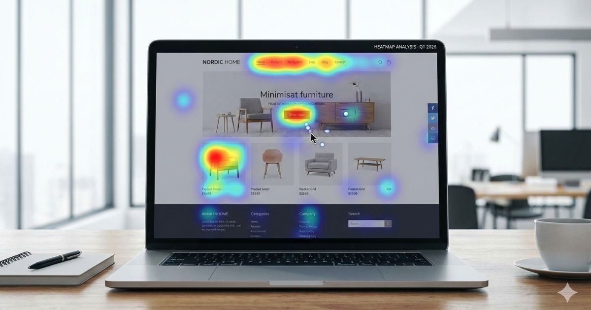
Metrics can help, but only when you know what to look for. High traffic with low action. Long time on page without movement. Drop-offs in places where nothing seems wrong. These numbers don’t always mean people aren’t interested. Sometimes they mean people are hesitating.
I’ve noticed hesitation tends to cluster around the same areas — unclear positioning, too many options, weak reassurance at the moment of doubt. When those patterns repeat, it’s usually time to step back and assess what the site is asking visitors to decide, rather than how many people are arriving.
One simple test I keep coming back to is imagining yourself as a stranger. If you landed on your own website with a mild problem and limited patience, would you know what to do next within a few seconds? Or would you need to scroll, think, and piece it together?
If the answer isn’t obvious, neither is conversion.
High converting websites don’t feel like puzzles. They feel like paths. And when a path isn’t clear, people don’t complain — they turn around quietly.
That’s why identifying underperformance isn’t about blame. It’s about noticing where effort isn’t being met with movement.
Once you see that clearly, the question stops being “is my website working?”
It becomes “what is it actually supporting right now?”
What High Converting Websites Actually Deliver
Most people expect more leads. That’s the obvious part. But what I’ve noticed is that the real shift shows up elsewhere first.
Conversations change.
When a website is doing its job, inquiries arrive warmer. People already know what you do. They already feel aligned. Calls stop being introductions and start being confirmations. You spend less time explaining and more time deciding together. That usually happens when the site has quietly done the work of qualifying intent before contact, without forcing it.
Lead quality improves for the same reason. High converting websites don’t try to attract everyone. They make it clear who they’re for — and just as importantly, who they’re not. That clarity filters attention naturally. Fewer inquiries, sometimes, but far better ones. And that trade-off is almost always worth it.
Something else shifts once ads or consistent content are added. Results become more predictable. Traffic stops feeling wasted. You don’t need to constantly adjust messaging on calls because the website is holding the narrative steady. That’s when people start noticing how conversion-focused structure improves ROI, even without increasing spend.
Time opens up too. Not because the business slows down, but because friction drops. You stop revisiting the same objections. You stop rewriting explanations. The website becomes a stable reference point instead of a weak link you compensate for.
And maybe the quietest change is confidence. Not performance metrics, but internal certainty. When you trust your website, you don’t hesitate to send people to it. You don’t apologise for it. You don’t feel the need to manage expectations before someone clicks a link. That confidence usually comes from knowing the site can carry its weight without you standing behind it.
High converting websites don’t just increase activity.
They reduce drag.
They create a sense of momentum that doesn’t need constant pushing. The business feels lighter, not because there’s less to do, but because everything is aligned toward the same direction.
And once that alignment is felt, it becomes difficult to go back to a site that simply exists.
The Smart Way to Fix or Rebuild a Website (Without Repeating the Same Mistakes)
Most redesigns fail quietly.
Not because the new website is worse, but because it’s built on the same thinking as the old one. New colors. New layout. New excitement. And the same results, just dressed differently.
I’ve noticed that when a website underperforms, the instinct is to change how it looks. But appearance is rarely the real issue. The issue is almost always upstream — unclear positioning, mixed messages, or a structure that doesn’t support decisions.
When a redesign starts with visuals, everything else is forced to catch up. Copy is squeezed to fit layouts. CTAs multiply to cover uncertainty. Proof is added everywhere instead of where doubt actually appears. The site ends up busier, not clearer.
High converting websites are rebuilt in a different order.
First comes strategy. Not vague goals, but real decisions about who the site is for and what it needs to support. Then messaging — the words and ideas that help someone recognise themselves quickly. Only after that does structure make sense. Pages know their role. Flow becomes obvious. Design then enhances what already works instead of trying to rescue what doesn’t.
This is why so many redesigns don’t improve results. They change the surface without addressing the system underneath. The same hesitation still exists, just in a nicer font.
I’ve also seen people rebuild too often, chasing the feeling of progress. Each redesign resets familiarity. Each change introduces friction. High converting websites aren’t constantly reinvented. They’re refined. Tested. Adjusted where it matters.
Fixing a website isn’t about starting over. It’s about listening harder to what isn’t working and being honest about why. Sometimes that means small structural changes. Sometimes it means rewriting one core page. And sometimes it means admitting the site was never built to do the job it’s now being asked to do.
The smartest rebuilds feel less dramatic than people expect. They don’t feel like a launch. They feel like relief.
Relief that the website finally makes sense.
Relief that it’s no longer fighting the business.
Relief that attention is turning into movement again.
And once that happens, design stops being a recurring problem and becomes something that quietly supports growth.
Get a Website Built to Convert — Not Just Exist
I didn’t always want to do this kind of work. For a long time, I was satisfied making things look good. Delivering pages. Handing over files. Letting results be someone else’s problem. But after seeing the same patterns repeat — effort without momentum, traffic without direction — it stopped feeling honest to keep separating design from outcomes.
High converting websites don’t happen by accident. They happen when someone is willing to sit with the uncomfortable questions early, instead of fixing symptoms later.
This work is for business owners who already know something is off. Not broken. Just underperforming. People who sense their website should be doing more than it is — carrying conversations forward, reducing hesitation, filtering for alignment before the first call ever happens.
What I focus on isn’t features or trends. It’s outcomes. Clear positioning. Calm structure. Pages that guide decisions instead of decorating them. A system that turns attention into movement without needing constant oversight.
The process usually starts quietly. A review. An honest look at what the website is actually supporting right now. From there, the path becomes obvious — sometimes it’s a rebuild, sometimes it’s restraint, sometimes it’s correcting one core piece that’s been pulling everything else off.
There’s no pressure in that. Just clarity.
If your website feels like a placeholder instead of a partner, that’s usually the sign it needs intention, not polish. And if you’re ready to treat it as infrastructure rather than decoration, the next step doesn’t need to be dramatic.
It just needs to be deliberate.
That’s the work.
And that’s who it’s for.
A Quiet Next Step
If you’ve been reading this and nodding — not because it’s new, but because it names what you’ve already been sensing — then your website probably doesn’t need more tools or trend-driven visuals.
It needs alignment.
If you want a clear, honest look at whether your website is helping or quietly holding you back, that’s a conversation worth having. No pressure. No overhaul unless it makes sense. Just clarity.
Sometimes that alone is enough to know the next move.
FAQs
Why is my website not converting visitors?
In most cases, a website isn’t converting visitors because it creates hesitation instead of clarity. People land, scan quickly, and feel unsure about whether they’re in the right place or what to do next. When positioning is vague, choices are too many, or trust isn’t established early, visitors don’t move forward — they leave. Conversion usually improves when a site does less explaining and more guiding.
How can I improve ecommerce conversion rate without rebuilding everything?
To improve ecommerce conversion rate, start by reducing friction rather than adding features. Focus on clearer product messaging, fewer distractions on key pages, faster load times, and simpler checkout flows. Most ecommerce gains come from making decisions easier, not from redesigning everything from scratch.
How do I reduce cart abandonment for small ecommerce stores?
To reduce cart abandonment for small ecommerce stores, pay attention to what happens at checkout. Long forms, unexpected costs, forced account creation, and too many steps create doubt at the worst moment. Simplifying checkout, being upfront about pricing, and removing unnecessary fields often has a bigger impact than traffic or ads.
Does website design affect sales?
Yes — but not in the way most people think. Website design affects sales less through aesthetics and more through structure. When design helps visitors understand where they are, what matters, and what happens next, sales increase naturally. When design competes for attention or tries to impress, it often gets in the way of decisions.
How should startups design their websites in the early stages?
How startups should design their websites comes down to clarity and focus. Early-stage sites work best when they speak clearly to a specific audience, explain one main problem they solve, and guide visitors toward one primary action. Startups don’t need complex features — they need alignment between message, structure, and intent.
Should I redesign my website or optimize it?
Whether you should redesign your website or optimize it depends on what’s actually broken. If the site looks fine but isn’t converting, the issue is usually messaging, structure, or flow — not visuals. Optimization often delivers better results faster than a full redesign. Redesigns make sense when the foundation no longer supports how the business operates today.
How Website Clarity Impacts Sales Conversations
Why Most Redesigns Don’t Improve Conversions
Understanding Buyer Behavior in Digital Spaces
